A while ago I came across this chart by Randall Moore, the creator of the webcomic XKCD. The chart aims at representing the average ionazing radiation dose due to different sources. As explained in the top of the chart, the radiation dose is measured in sieverts (Sv). The sources reported range from regular activities, such as airplane flights or medical procedures, to doses due to carastrophic events such as Fukushima and Chernovyl.
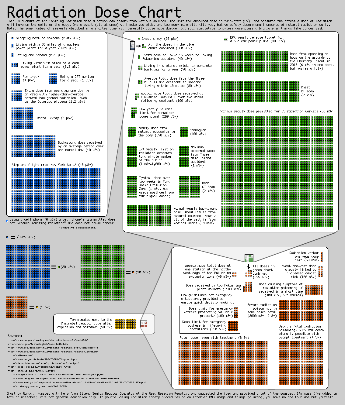
The main objective of the visulization, however, is not just reporting the absolute values of this sources but representing their relative strength. The graph tries to make really apparent the different orders of magnitude of the different doses, which is a concept often difficult to graps when just a number is reported.
I think the visualization uses some effective techniques, such as embedding the previous order of magnitude chart into the next to clearly represent their relative importance. However, I think the chart as a whole is not as clear as it could be. There is a significant amount of text, and the goal of the visualization is not inmediatly clear upon first inspection. I also think the layout could be improved by placing each order of magnitude either above or below the other one, to create a linear path for the viwer to follow.
The chart is directed to a general audience, although to understand it’s relevance you have to already know what radiation is.