A Map of the Internet

I was reading about the recent selling of IPv4 addresses by MIT to Amazon and in some of the discussion a rather old but classic data visualization popped up:
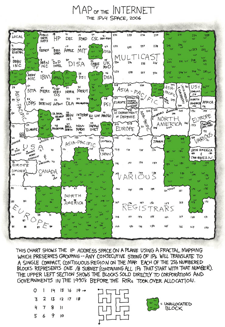
This is, of course, the xkcd “map of the internet”. The data that is being shown is which entities own certain IP address ranges: essentially blocks of the internet. For example, in the data visualization we see that MIT owns IP prefixes that start with 18.

The audience of this is the same as the usual audience to xkcd, which is very broadly speaking nerds on the internet. The goal of the presentation I think is to show that relatively few players control the whole internet; you’d think that with there being over 4 billion possible IP addresses there would be a lot of freedom but in reality there are only around 100-200 players who own everything and license out IPs to others.

I think the visualization is effective given the target audience. To a general person, this is probably too cluttered because so much data is being shown. However, as xkcd viewers are generally “nerdier”, they will be willing to spend more time to investigate and thus that issue wouldn’t immediately discredit the visualization. The fractal mapping explained at the bottom is an efficient way to compress the previously 256 data points to a 16 x 16 square while still keeping contiguous regions together (so for example, the blocks Europe owns are all grouped together) which greatly enhance readability given the constraints they’re working with. Probably the only glaring flaw I’d say is this is outdated; this was made 11 years ago and the IP address layout has changed quite a bit, so it shouldn’t really be used as a discussion point today anymore. However, in its time I think it did a great job given the target audience and the data it wanted to present.

Girl Scout Cookies

I chose to review a data infographic about the very popular and delicious Girl Scout cookies. Anyone who is a fan of these cookies would enjoy this infographic. It doesn’t have an agenda or stance but rather just provides lots of fun facts and history. The end goal is to build interest. The infographic is long, so I’ve clipped out the best parts.

The image above appears at the top of the infographic. I like the way the green ties together the number and the banner. It would be even more impactful if the number was directly related to the data in the green box. Otherwise, the actual layout of the top is busy and not very visually appealing.

The picture above shows how much each girl scout cookie contributes to their total sales and includes how many calories worth was sold. The bar graph below shows how many boxes of each cookie were sold. It uses two colors but doesn’t identify what the different colors mean. Plus, there is another row of cookies below it that have no discernable purpose other than to add clutter. Also it would’ve been nice to know how many calories each cookie was because without knowing that, quantifying them in calories is impossible to interpret. This can technically can be calculated from the provided information, but it just makes me think that there must’ve been a better way to coordinate the information in the two main graphs. I also really don’t like the colors. They all clash with each other and it makes me eyes hurt to look at the infographic for the amount of time it took to write this.

Later on in the infographic, it has pictures of old, discontinued cookies as well as a recipe for the original cookie at the very bottom. The information is really fun to know. It is worth noting, however, that the graphic has an odd jumble of information. The focus on calories in the first half made me think it was going to have some sort of message about health. Then, by the end, it was telling me to make cookies. Thus while the infographic is interesting, it has no overall purpose and the parts don’t work together effectively.

http://www.dailyinfographic.com/the-business-nutrition-of-girl-scout-cookies-infographic

Exploring Sustainable Energy Policies Around the World

The internet is littered with poor data presentations on climate change. The storytelling in the charts is often ineffective, and the connection to human activity is often absent. In many cases, the “so what?” and the “call to action” are missing from these data presentations.

One example of the effective presentation of data is a new tool by the World Bank to rate sustainable energy policies in more than 100 countries. Referred to as “RISE” (Regulatory Indicators for Sustainable Energy), the tool is a scorecard that grades countries in three areas: energy access, energy efficiency, and renewable energy.

As shown below, the map enables users to explore a country’s policies and regulations in the energy sector, and also compare scores (more than 25 indicators are tracked) across countries. Users can also download the underlying data.

Source: http://rise.worldbank.org/

Source: http://rise.worldbank.org/

The intended audience for this tool is policymakers, since it can help them identify policies and regulations to expand and improve sustainable energy. However, anyone who is interested in sustainability or climate change will find the tool valuable.

The RISE tool is effective because it is interactive and communicates the data visually. It also displays relevant information and filters it down to the most essential bits. Most importantly, it provides actionable information, enabling the user to make data-driven decisions.

It can be improved in a few ways, however. For example, enabling the user to change key parameters easily and run simulations would provide greater transparency and insight into the specific actions that would be required to reach specific goals. The tool could also be improved by adding functionality to recommend policies or actions to take based on a country’s profile (geography, resources, demographics, regulatory/legal framework, politics). Still, RISE is a remarkable tool that can serve as an example of effective data presentation on climate change.

GiveDirectly – send money directly to people living in extreme poverty

Source: https://www.givedirectly.org/

In the field of development economics there are two main points of view on how to most effectively lift poor people out of poverty.  One school of thought is that the only way to help them is to give them access to resources like livestock, housing, food, etc.  Another more controversial point of view is that the most efficient way of helping them is to give cash directly to them and allow them to help themselves.  This website, GiveDirectly is one particular organization I came across recently that allows donors to give cash to the extreme poor with the push of a button.


Its home page displays several images and quotes from recipients of cash transfers, and it also displays several data-based graphics.  One pie chart shows the percentage of every donated dollar that actually ends up in the hands of the poor.  Two line graphs show the annual donations and the households enrolled in the program from 2012 to 2016.  The photos, quotations and data visualizations on this page clearly targets individuals in developed nations who have a passion for alleviating world poverty and have the capacity to donate money.  As can be seen by the big green “Give Now” button in two locations on its home page, the main goal of the site is for every visitor to donate money.  This goal is supported by both qualitative images, as well as quantitative data.  The qualitative information appeals to the emotional side of the visitor.  We see real faces, read real quotes, and can watch real live video of the people who we are helping.  The quantitative information appeals to our desire to see the result of our actions.  What percentage of my money is going into their hands? How many households are involved? How well is the program performing as a whole in comparison to other similar programs?  These are the questions that the graphs and chart answer. The upwards trend of the graphs along with many big “+” signs and even the choice of green for the text all give the viewer the idea of growth and money.  This is likely what the creators of the graphics had in mind.  The viewer is emotionally and logically driven to donate money because of the imagery and data that indicate that their money will improve lives and promote growth out of poverty in an efficient manner.  I therefor find the infographics on this page very effective.


Space Exploration in our Solar System

Source: http://www.sciencealert.com/this-glorious-map-helps-you-keep-track-of-every-space-mission-in-the-solar-system

I really like science posters, but this one has a special place in my heart. It contains a massive amount of information, but still presents a relatively simple narrative of the wonder of space exploration.

This poster lays out information about all of NASA’s space missions from 1959 to 2015. On the top half, the flight paths are shown in thin lines, recording which celestial bodies the spaceship orbited. The bottom half of the chart contains more information such as the target of that spacecraft, the purpose of that mission (such as a flyby, orbiter, or landing), and what the spaceships looked like.

The main focus of the poster is on the spacecrafts, not the correct spatial orientation of our planets and their moons. As a result, the primary audience for this poster infographic is a space exploration enthusiast, someone who would enjoy knowing ridiculously specific trivia about NASA’s space missions.

Notably, this poster also focuses primarily on NASA space missions, and doesn’t mention any probes sent by European or Asian countries. In addition, flyby missions are still represented with a flight path that orbits the entire planet or moon, exaggerating the flight path a little. This suggests that the Pop Chart Lab that created this poster primarily wanted to celebrate NASA’s achievements in space exploration. In addition, the sheer scale of this poster was probably meant to inspire wonder and awe in NASA’s accomplishments.

Personally, I felt that this poster was effective for me, although the bottom half takes up too much space. However, the general public may be overwhelmed by the data overload.


The Rhythm of Food

Google searches on the universal topic of food can tell a very interesting story about food trends. I recently came across The Rhythm of Food, a collaborative effort between Google News Lab and Truth & Beauty to explore patterns in food trends based on Google searches over the years starting from 2004. 

The one-page website provides a scrollable, rather adventurous experience of viewing food trends, starting with the rise and fall of certain diets, cuisines, and recipes between 2004 and 2016. Scrolling further yields a circular timeline for the apricot fruit with annotations that explain how to interpret the timeline. The popularity of Google searches for the food item is measured by a Google Trends score collected weekly.

Apricot circular timeline with annotations

A visitor to the website can view food trends by month to see what’s trending at a specific time of year. A visitor can also discover specific food trends with a more advanced search.

advanced search for food trends

It is hard to simply stumble upon this website, and given the large collection of food items with timelines, I think this data presentation is for people curious about the seasonality of a specific food item or looking to discover food trends in general.

The website does a good job of presenting the data as a story. Each food item has its own story in the form of a circular timeline and the website presents the data visualizations in a story-like way that encourages the viewer to keep scrolling to answer questions like “What are the most common patterns?” Some timelines even have special annotations for events that triggered sudden popularity. Personally, I wish there was also a way to compare seasonal popularity between different food items in a single interactive visualization.

The Story of California’s Drought

I’m from Southern California, and one of the biggest issues in the state recently has been the drought. This series of 259 drought maps shows the drought level in the state of California from December 2011 to February 2017.

At the top of the visualization is a legend assigning a color to different drought levels:

Legend

The drought maps are then displayed chronologically in a grid, left to right and top to bottom.

The sheer amount of red on the maps in early 2014 helps viewers easily understand how dire the situation was and why Governor Jerry Brown declared a State of Emergency in January 2014:

Early 2014

Scrolling to the year 2015, California is mostly dark red, indicating a level of “Exceptional Drought”. The shrinking of dark red areas in the spring 2016 maps show that the drought is improving. And then in early 2017, only a small part of California is dark red and in extreme drought:

Early 2017

This visualization clearly tells the story of California’s drought. The yellow-orange-red color scheme connotes fire and heat, which is strongly correlated to drought, and the color gradient for different drought levels reflects light/dark color connotations in society. The viewer can easily identify the year corresponding to the maps, and a date pops up when the viewer hovers over a particular map. Being able to instantaneously see maps from different times really helped me understand when the drought got worse, how bad it was, how long California was in “Extreme Drought” for, and how impactful the storms last month were.

Although the viewer may get lost in the rows of red/orange/yellow sock-like shapes, I think the designer’s choice to lay out the maps really serves its purpose of guiding the viewer through the story of California’s drought. If the designer had used a single map and a scrollbar that, when dragged, alters the map to reflect the drought over time, some parts of the story might have been lost in the time-lapse because the viewer would only be able to make immediate comparisons. This data presentation relies on color connotations and a series of snapshots to enable Californians, people interested in climate change, and others curious about the drought to better understand how drought levels changed in California in the past 4 years.

Crazy Things That Are Illegal (And Legal) To Do In A Car

Have you ever wonder whether driving while wearing headphones is legal? Or if you can drive barefoot?. All these questions and more can be answered through an interactive visualization platform called “Is it illegal to Drive ..?“. The platform uses a nice map to provide the answer to the most-Googled questions about driving laws in the US. It is developed by Just Park to show the inconsistencies in U.S. driving laws.

The platform lets you click on an animated map of the United States with bubbles for each state. As the headline question changes, the bubbles change color to show whether an action is legal (green), inadvisable (yellow), or illegal (red.)

Inadvisable activities can possibly get you in trouble, depending on the discretion of a traffic officer. My advice is if you see anything not green, just avoid doing it. That includes, for example, driving while tired or barefoot.

Also, one of the most surprising facts in this mini-site, that driving your car with a beer in your hand will not get you cited as long as you are under the legal limit in Mississippi. You can find several interesting driving facts on the platform, and if you want to fact-check the numbers, there is a Google Docs spreadsheet with all the sources.

In the US, finding driving laws is not simple, since it depends on in which state you are in. The goal of this interactive platform is to speed up the process of finding answers by visualizing what is against the law and what isn’t in each state. In that way, people can find their answers and gain more knowledge about the driving laws in general in the US. This platform is intended for a broad range of people, so the use of interactive visualization is an efficient way to enforce laws. Also, it encourages people to know their rights without having them to read endless documents.

In the end, stay away from New Jersey, unless you want to speed past a funeral procession while wearing headphones, and with a missing front bumper car.

Radiation Chart

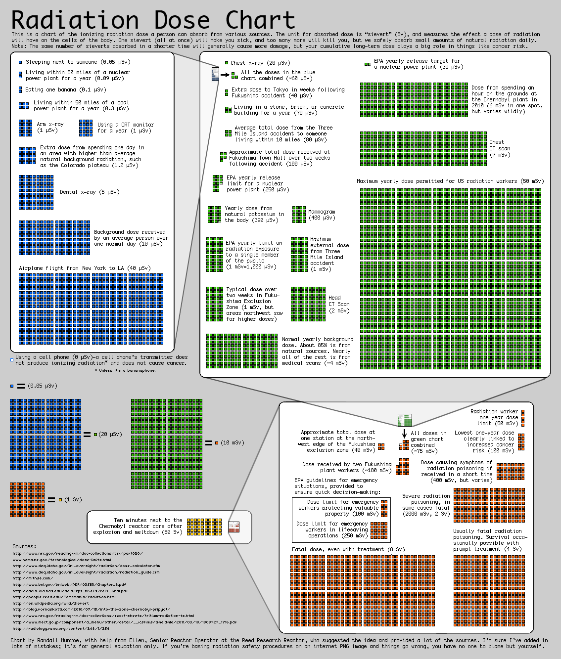
A while ago I came across this chart by Randall Moore, the creator of the webcomic XKCD. The chart aims at representing the average ionazing radiation dose due to different sources. As explained in the top of the chart, the radiation dose is measured in sieverts (Sv). The sources reported range from regular activities, such as airplane flights or medical procedures, to doses due to carastrophic events such as Fukushima and Chernovyl.

The main objective of the visulization, however, is not just reporting the absolute values of this sources but representing their relative strengthThe graph tries to make really apparent the different orders of magnitude of the different doses, which is a concept often difficult to graps when just a number is reported.

I think the visualization uses some effective techniques, such as embedding the previous order of magnitude chart into the next to clearly represent their relative importance. However, I think the chart as a whole is not as clear as it could be. There is a significant amount of text, and the goal of the visualization is not inmediatly clear upon first inspection. I also think the layout could be improved by placing each order of magnitude either above or below the other one, to create a linear path for the viwer to follow.

The chart is directed to a general audience, although to understand it’s relevance you have to already know what radiation is.

Are You As Smart As You Think?

What makes data presentations really powerful, is when users are not only passive consumers. I recently found a striking example for that. It´s a New York Times article called “You Draw It: What Got Better or Worse During Obama’s Presidency”. It shows how indicators of key policy issues developed during the Obama years: e.g. national debt, unemployment rate, number of crimes or troops abroad.

Readers are shown the data for the Bush years (2000-2008). They then can get active and draw what they think might be the line for Obama´s time in office (2008-2016).

In a second step, you are presented with the actual data (blue line) and some additional explanations.

I think this presentation is made for a broad general audience, for readers that are willing to test their own perception against the actual facts. Or as the NYT puts it: “See if you’re as smart as you think you are.”

This piece was published after the November election and before the inauguration of Donald Trump. I see two main goals the authors tried to achieve: first of all, it helps readers assess the performance of the Obama administration on the basis of hard facts. Secondly, it confronts readers with their own potential misjudgments.

Was it effective? I personally was very much attracted by this playful and interactive approach towards stats. I am not sure whether I would have read an article on that topic with just static charts.