Quarterback Pocket Pressure

In a recent article leading up to the Super Bowl, the New York Times used visuals from Second Spectrum analytics to highlight the impact of quarterback pressure on performance. The first visual highlights the disparity between completion percentage for quarterbacks when under pressure versus with a clean pocket to throw from. The visual compares this disparity for all thirty two NFL quarterbacks benchmarked against the league average and particularly highlights the Patriots and the Falcons. The Patriots fall from the fourth ranked to the sixteenth ranked team under pressure while the Falcons only drop from second to fourth.

This comparison leads into the next visual which uses new data released by the NFL to create a heat map showing defender traffic around the pocket in games Brady and Ryan both lost. The graphic also shows the average defenders in the pocket per snap benchmarked against the league average and team average. This element of the visual allows readers to better quantify the significance of the heat map.

These visuals aim to show that while pressure significantly effects the performance of all NFL quarterbacks, Tom Brady is particularly susceptible. Thus, a game plan designed to focus on pressuring Brady is the optimal strategy for the Falcons to defeat the Patriots in the Super Bowl. This data presentation was intended for readers who wanted a deeper analysis of the upcoming Super Bowl, and was successful in doing so by using a new data set to draw an intriguing comparison on the games key players.

What Would It Take To Turn Blue/Red States Red/Blue?

Over the course of the last two years, I have become much more interested in politics, particularly the election strategy process. For example, there are so many small ways candidates/parties can influence outcomes by targeting their messaging by demographic, or working to increase/decrease voter turnout in certain regions. In learning more about political issues and this process, I’ve turned to fivethirtyeight, as they often have amazing interactive graphics and aggregate data from many different resources in their models, but target an audience with some education about data analysis.

This interactive visualization allows users to adjust voter turnout percentages and political leanings by demographic, and shows the resultant electoral college map, based off of 2012 election data scaled for population changes. When I came across this graphic a few days ago, I thought it was the perfect tool to test my assumptions about certain demographics. I did this with my thoughts on my home state of Michigan, which usually goes blue, but went red in this election. I decreased black voter turnout a bit, and increased the republican leaning and voter turnout for non-college-educated whites, the two factors which are being most attributed to Trump’s winning of Michigan’s electoral votes. This was just enough to flip Michigan to red, and flipped Pennsylvania and Wisconsin as well, both key states that went red in this election.

This interactive is probably most targeted towards people with a good grasp of the electoral college and specific hypotheses they want to test regarding this past election. It does provide a clean interface for learning about the demographics, both in this aggregate method and on a state-by-state basis further down the page. However, I think it would be more effective with some more demographic factors such as age range. The interactive was also published in October before this election outcome, so having a revised section post-election with the updated data on these percentages of voter turnout would create more relevance and make it more accessible to a wider audience.

A World of Change

This Google Trends interactive shows how searches reflect the way people from around the world think about climate change. It displays search volumes in 20 major cities from 2004-2015, for topics such as energy, recycling, oceans, air pollution, and other words and phrases that relate to the environment.

After selecting a topic, the geometric globe rotates as searches from around the world are displayed. The letters in the searches appear one after another, creating a typing effect. Each search covers roughly the size of an entire continent on the globe, making the globe seem like a small, intimate space, instead of an incredibly vast planet.

You can also click on specific cities and learn more about that city’s concerns regarding a certain environmental topic.

According to Simon Rogers, a contributor to the interactive, the goal was to take Google’s enormous amount of data (there are over 3 billion searches a day) and “make those huge numbers meaningful.” The interactive accomplishes this goal by presenting a snapshot of searches and allowing the user to explore specific topics or cities in just enough detail to pique their interest, but not too much to be overwhelming.

This interactive is geared towards casual views who are interested in learning more about attitudes towards climate around the world at a high level. The interactive isn’t targeted at people who are already experts in this domain or people who want to dive deep into data analysis.

The Political Compass

Last semester, I studied voter advice applications. More specifically, I dug into the methodologies used by these applications to recommend political candidates based on the users’ political stances. Most applications provided a ranked list of recommended candidates at the completion of the questionnaires, but a website called The Political Compass took a more passive approach.

The Political Compass represents one’s political ideology through coordinates on a two-dimensional scale, with one axis representing the social spectrum and the other representing the economic spectrum.

This two-dimensional scale represents the different combinations and degrees of political ideology.

After taking their questionnaire, I can see where I’m placed on their ideological scale, as well as where candidates and world leaders are placed. I notice my coordinate position is close to those of certain candidates, which means The Political Compass concluded that those candidates and I share similar ideologies.

After completing the questionnaire, users are placed on the scale to determine their political ideology.
This is how “The Political Compass” places 2016 U.S. Presidential Candidates on their scale.

This implicit conclusion sends the message that I ought to view those candidates more favorably, and that people on similar positions on the scale are similar in ideology. I can imagine this process elicits varying reactions from users—I’d personally feel a bit upset if my coordinate position was close to Hitler’s. Not to mention, these results present a metric for candidate-to-candidate and candidate-to-user comparisons, which can either confirm or contrast one’s preexisting opinions about the political arena.

Applying the liberal/conservative spectrum to the economic/social axes seems to overly simplify the meaning of ideology, but people do seem to view political stances through binary lenses. Including other factors or dimensions would hopefully signal a shift away from a polarizing approach to politics.

Super Bowl LI

In preparation for Super Bowl LI, I was researching the game to understand the dominance of this sporting event and subsequently stumbled across this infographic produced by WalletHub. The infographic is subdivided into multiple sections; Super Bowl LI, Game Day Notes, Media Extravaganza, Ticket Prices, Super Bowl Ads, Pigging Out at Pigskin Parties, Big-Game Betting, and Super Bowl Economics. Below each section is 3-8 different statistics overlaid on an image.
The audience of this data presentation is sports fans, or at the very least those who have some interest in sports. The statistics present are unconnected, and to be best understood, require some sporting knowledge. This is why I believe the targeted audience is those who are interested in sports.

By providing statistics in a variety of categories that pertain to the Super Bowl, the data presentation aims to convey the magnitude of the game and therefore increase interest in the game. By presenting the massive reach of the game in the form of an infographic readers who do not normally watch the Super Bowl may have a new interest and join the bandwagon by viewing the game. The effectiveness of this data presentation in limited by the lack of comparison for the numbers. For example the infographic lists “70 total cameras used by Fox Sports”. Based on the context of this infographic, one will probably assume this to be a large number, but the reader does not know how many cameras are used in a regular season football game, TV show, blockbuster movie, or another sport. If a comparison was provided, readers can better appreciate the statistic and thus better evaluate the reach of the Super Bowl.


Source: https://wallethub.com/blog/super-bowl-facts/1589/

Note: Apologies for the low-quality image. I did not realize the quality until I made the post. The link provides a high quality visual.

The Education Gap

With the recent confirmation of Betsy DeVos for Education Secretary, equal access to education for everyone is once again a hot topic.  This New York Times article from April 29, 2016 addressed the issue.

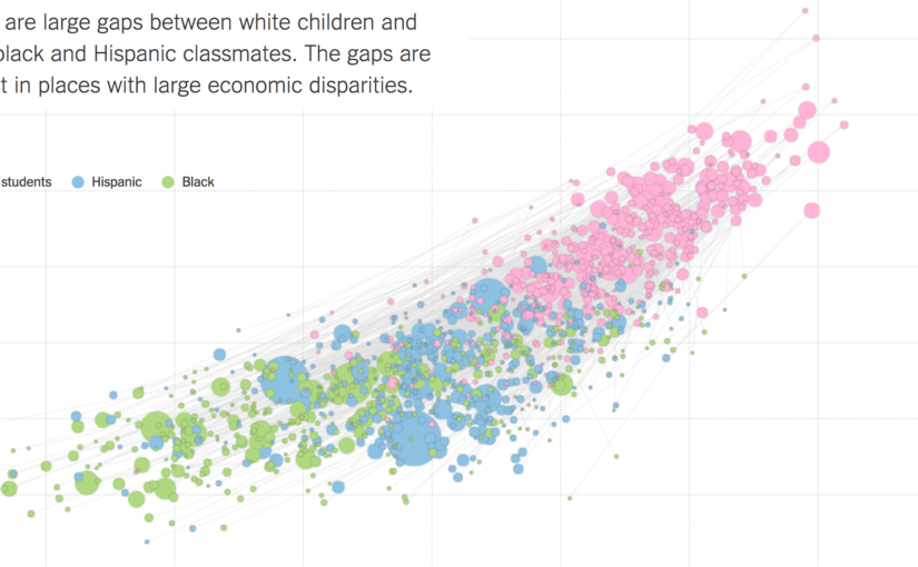
Although there were several graphics in this article, this one stood out the most to me.  This graph shows a student’s parents’ socioeconomic status on the x-axis, and their relative academic achievement levels on the y-axis.  The size of the dots represent the size of a racial group within a school district, and the color represents the specific racial group.  It is striking how white children seem to outscore minorities in a consistent fashion.  However, this data fails to control for geographical differences, or any other potential confounding variables.  Maybe white students tend to live in richer areas, which provide better education?

The next graphic in the article quickly debunks this idea.  Each line segment corresponds to a school district, which is more obvious in the interactive graphic when you mouseover a line segment and the district is displayed.  Even within a school district, white children consistently outperform their minority counterparts.

So why is this?  The article does not attempt to elevate any one explanation.  The intended audience is not clear, although the NYT does tend to gravitate towards more educated, liberal readers.  The goal does not seem to be to convince the reader to adopt one political position or the other, or even to explain the data.  Instead, it simply presents it.  By giving a clear, easily digestible picture of the data, the article allows the reader to make their own conclusions.  Whether this is desirable, or even responsible, is another question altogether.  However, it is clear that this is enough data to make anyone think about the underlying issues, and thus I believe the creator has succeeded in drawing attention to the issue, which was no doubt his original intention.  It is up to the reader to figure out why this phenomenon exists, and it is up to our generation to correct it, so equal opportunity is available for all.

Sean Soni

The Climate Lab Book’s Climate Spirals

The Climate Lab Book is a blog that is “an experiment in ‘open source’ climate science.” Written by climate scientists with the purpose of “promoting collaboration through open scientific discussion,” it features a variety of data visualizations, resources, and perspectives–all scientific.

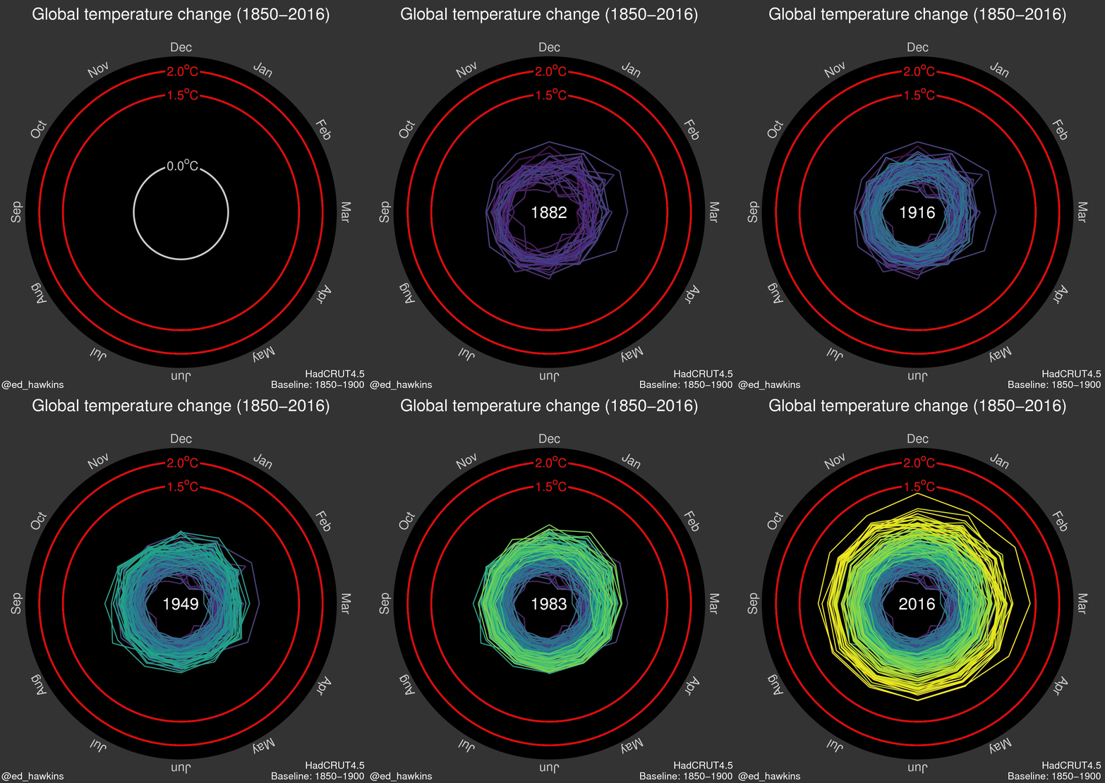
Currently, it features “Climate Spirals” that depict how climate change has, in a way, spiraled out of control over the last several decades. Although the blog’s purpose is to engage in scientific discussion, the visualization is accessible to more than just scientists, and seems to help people realize the reality of climate change.

The first spiral depicts global temperature change (in degrees Celsius) from 1850-2016.

The second spiral depicts atmospheric carbon dioxide concentration (in parts per million) from the same period.

The visualization if effective in furthering the message of the reality of climate change. Rather than only have the radius depict the steadily increasing magnitude of global temperature and atmospheric carbon dioxide concentration, the color choices for the progression of the spiral from cool colors (such as blue, green) to warmer colors (such as yellow) reflects “global warming. The dynamic nature of this visualization encourages the viewer to engage with it more than a static visualization does. The speed at which the visualization iterates through the years reflects how fast the effects of global warming have come upon us, potentially pushing its viewers towards alarm and action.

However, this visualization could be made more engaging through interactivity. This could be in the form of a sliding bar that a user could manipulate to control what year at which to the viral is at.

NBA Math – Quick and Comparable Information

I’m definitely an avid NBA fan and a lot of the accounts I follow on Twitter are geared toward providing me with information about the league and the teams I like to keep track of. One Twitter account that I found just a few weeks ago, NBA Math, tries to provide an objective assessment of the league by crunching numbers, specifically through their TPA model that takes into account a per possession conversion of the events that occur throughout the course of games.

Their TPA model often provides a two-number evaluation of players and teams that can be broken down into an offensive and defensive score. Viewing these computations in a table ordered by greatest difference can be a great way to visualize most of the information one would want, but makes comparing quite difficult and tedious.

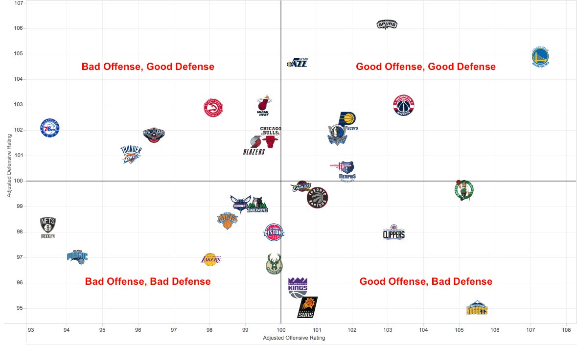
Many of the tweets they send overcome this by displaying the teams on a simple x-y coordinate graph where the axes represent the offensive and defensive scores.

Adjusted defensive and offensive scores for each NBA team since 1 January 2017 VIA NBA Math

While the aesthetics of the display may be bland, presenting it this way is incredibly powerful and allows a Twitter user to be able to make the quick assessments that are typically favored on a social media platform. They are on the site to get quick bursts of information and this type of data platform allows a single tweet to streamline a lot of information at an incredibly rapid rate. Seeing how various teams positions differ can be done with great ease, allowing a user to identify where there team stands and how they might need to improve relative to the rest of the league and the teams that, by popular opinion, are considered elite.

It’s very unclear how effective a model that tries to boil down performance into two numbers can be useful and effective. However, the ability of NBA Math to send out bursts of tweets in this variety can capture the attention of Twitter users easily allowing them to show off this model and try and convey the information they’re gathering about the league.

Link to Tweet: https://twitter.com/NBA_Math/status/829369301899567104

Bloomberg’s Cabinet Graphic

For the past two years, Bloomberg has been publishing interactive data graphics. I first found them in 2015 after reading their post on climate change. Since then, they posted many more, mostly about politics and finance. A more recent one is about Trump’s cabinet nominees, titled “Trump’s $6 Billion Cabinet: Mostly Men, Mostly White and Not Much Government Experience”.

The data presentation takes the form of two tables: one that compares Trump’s cabinet nominations to the previous two presidents (top picture), and one that gives more detailed information about each nominee (bottom picture). The graphics take special notice of the race, gender, government experience, military experience, and wealth of each cabinet member/nominee.

As the title suggests, the goal of the presentation is first to highlight the similarities and differences between Trump’s cabinet and previous cabinet (his cabinet has roughly the same diversity as Bush’s, but far less government experience than both Bush and Obama), and also to educate viewers about the nominees and cabinet members (achievements, past boards, recent news, public stance on issues, wealth). The categories it chooses effectively reveal a stark contrast between past and proposed cabinets, and the extra information in the table along with the related links for each nominee make it a useful tool to become informed about each person. The experience is a little diminished by the weird scrolling behavior.

The graphic is catered to casual viewers – people who maybe do not follow every political announcement but want a brief overview; a lot of the information would be redundant to people who follow politics vigorously, although the tables give a concise summary that may be good for reviewing.

Overall, Bloomberg’s graphic about the cabinet effectively informs viewers about Trump’s new cabinet – how it’s compares to previous ones, who is on it, and what to expect from the members.


Lose it – Gauging Portion Sizes

With a new year comes new years resolutions, and my personal goal of eating healthy recently lead me to explore a new app called Lose it. One of its features gives users visuals of how large servings sizes are for various food groups. Like any other food-tracking app, you can enter in what you ate and how much you ate, but Lose it tries to help you gauge portion sizes with graphics like the one shown below.

Lose it appears to be marketed towards a younger, modern audience that wants to track their food consumption and lose weight. The app is filled with bright colors, sans-serif fonts, and motivational weight-loss phrases. The goal of the infographic, as well as the entire app, is to convince users that calorie-counting can be simple through Lose it. Remembering what items you’ve eaten in a day is hard enough, but knowing how many cups or grams of each food you consume is harder.

Lose it presents serving size data very effectively. Cups and grams are difficult for most people to gauge. I have seen various other attempts at visualizing serving sizes and few have been as effective as the ones in Lose it. Others generally compare food servings to lesser-known objects (ex: one bagel serving is the size of a hockey puck) which are still hard to understand. Lose it makes an effective presentation by using common objects (eggs, golf balls, baseballs) for comparison and including a picture of the food next to the object for reference. Combined with an easy-to-use UI, Lose it’s graphics make serving-counting much simpler.