Extending and Reworking “Polar Bear and Glaciers: Seal Your Survival”

by Margaret Tian, Tina Quach, Tony Zeng, Willie Zhu

Depiction of our game in progress.

Intro

Our project was a physical board game titled “Polar Bears: Seal Your Survival” that aimed to teach kids about the impact of global warming on the Arctic. We focused on making the game engaging, by emphasizing interactivity. The board game format is well-suited for kids, because the short play sessions are able to hold their attention, while still teaching them about global warming. See images of our game in this deck of slides.

The rules of our board game are linked here. We generally modeled our game off of Candyland. In each round, the players were pregnant polar bears trying to gather enough food to survive the winter by collecting 8 seals before reaching the end of the game. There were 3 rounds overall that corresponded to the summers in 2012, 2014, and 2016 in the Bering sea. Our board featured two types of tiles: water and ice. The number of ice tiles decreased between rounds to symbolize the melting polar ice caps. Players rolled two dice to move, and drew a corresponding ice or water card. The ice cards generally gave better results than water cards (i.e. more likely to gain seals or experience other good events) since it’s easier for polar bears to hunt and survive on ice.

To give kids an idea of how melting Arctic ice connected to the rest of the world and generally educate them on fighting global warming in their daily lives, we also mixed in “fight global warming” cards into each deck. These cards had questions about global warming that all players had to work together to answer. If correct, players would either gain seals or add ice onto their board. A lot of time was spent calibrating the distributions of cards to make the game challenging yet still enjoyable.

Methodology/Data

Our data sources included NASA Arctic ice coverage data and many online articles about global warming, polar bears, arctic wildlife, and climate change.

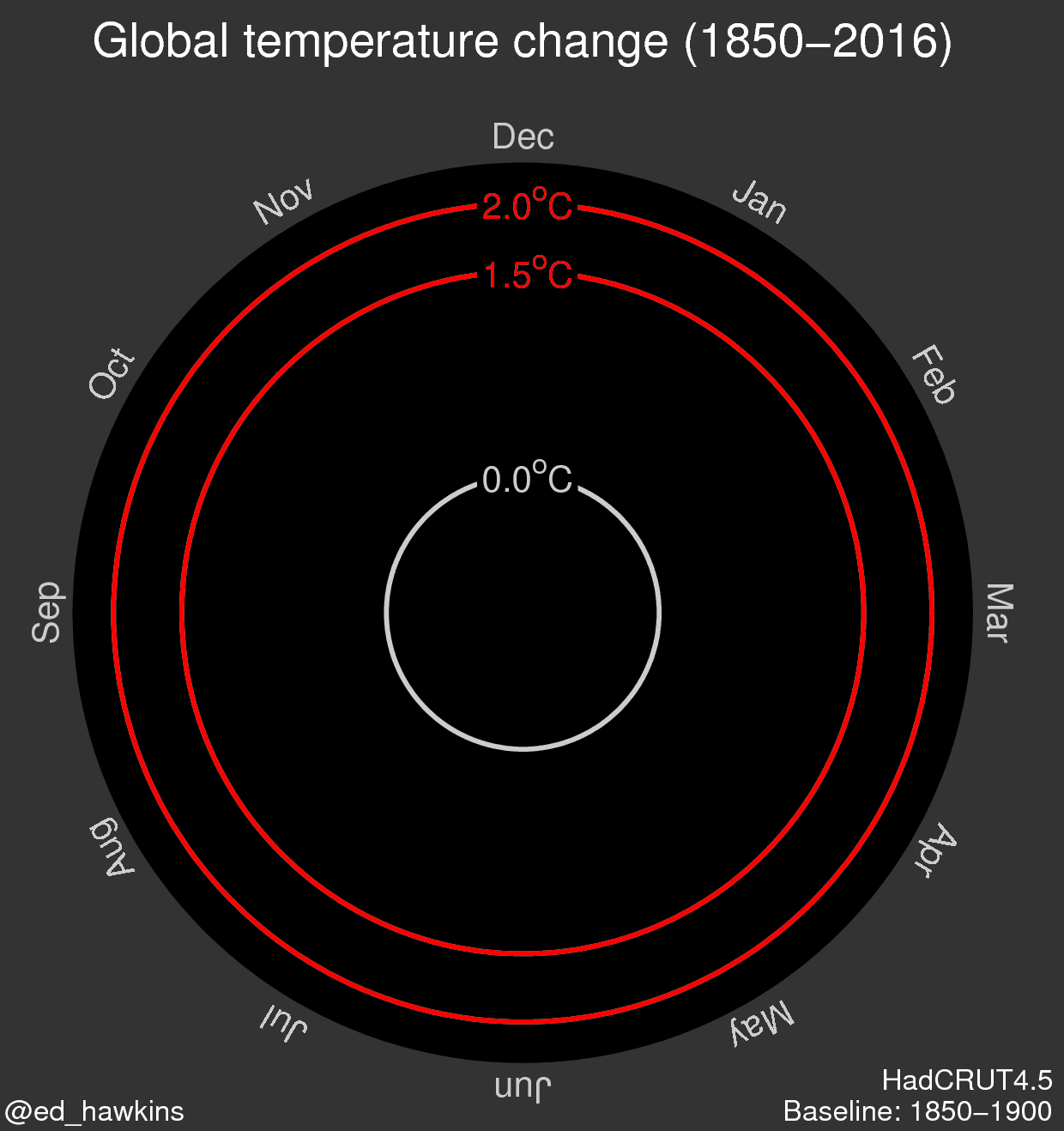
We worked with NASA Arctic ice coverage data (csv) in order to correlate difficulty of our game with shrinking ice caps. We used ice cap data from summers in the Bering Sea in 2012, 2014, and 2016. Without needing to clean the dataset, we found that the amount of ice decreased 25% from 2012 to 2014 and 15% to 2014 to 2016.

The area of ice caps during summertime in the Bering Sea decreased 25% from 2012 to 2014 and 15% to 2014 to 2016.
The area of ice caps during summertime in the Bering Sea decreased 25% from 2012 to 2014 and 15% to 2014 to 2016. 

The changes between each “round” of our board game were based on ice cap data. The depicted decrease in ice from 2012 to 2014 to 2016 is reflected in our game as users start off with all tiles as ice and must add water tiles in every round (reducing access to ice tiles). This affects game difficulty because ice tiles have more cards with positive consequences (such as +1 seal or +2 seal) than water tiles do. Our game started with 70 tiles of ice, which decreased to 54 and then 36 ice tiles.

We also pulled from online sources–ranging from news websites to advocacy groups websites to informational websites about animal habitats–to get facts on polar bears and global warming. With the intention of integrating these facts into our ice, water, and global warming cards as well as the rules of the game, we compiled a database of card content that can be seen in this spreadsheet, which includes citations and links to our data sources. This research affected our rules–we determined that users would need about 8 seals to survive per round based on the fact that pregnant polar bears need to 400 lbs of fat to survive the winter and each seal is on average 50 lbs.

Analyzing our Impact

Audience

Our audience is 11 – 14 year olds who like animals may have heard about the impact global warming has on animals, but have not really internalized its devastating impact and ways in which they can try to fight it. Our overall aim is to use the specific example of melting ice caps and polar bears to teach these youth about how global warming hurts the animals they care about.

Goals

Our goals can be broken down into short term, medium term and long term goals:

Short term:

  • Players should recognize that global warming causes melting ice that impacts wildlife.
  • Players know at least 3 ways you can fight global warming.

Medium term

  • Players will tell their parents and/or friends about global warming.
  • Players should believe that they can make a difference against global warming.

Long term

  • Players will change their behavior to work against global warming (e.g. choosing eco-friendly transportation, reducing overconsumption and waste, etc.)

Play Testing

In order to evaluate the impact of our board game in promoting a fight against global warming and strong understanding of global warming’s impact on Arctic wildlife, we ran through one full gameplay session with three 7th grade kids from the local Cambridge area.

We found that these 7th graders had fun with the game–upon finishing the game, their immediate response was that they would play it again. However, we did notice that kids didn’t really read the facts that came along with every card in the game (drawn on each turn). Only one of the kids glanced at facts on cards.

However, another aspect of the game, adding water tiles in 3 successive rounds to model increasing difficulty over time, was effective, as one kid commented that they didn’t like water tiles because they made it harder to win, just as melting ice makes it harder for polar bears to hunt. Additionally, global warming cards that were meant to encourage the kids to engage with questions of global warming’s impact and the actions they can take, were harder than intended. This supports our game’s potential for impact in that these hard questions, although potentially discouraging, can really teach those that play the game. Play testing also revealed that, it’s a challenge to make kids consume information if it is optional to–even if the information has been integrated into a game as in ours.

Evaluation

In addition to analyzing the gameplay, we also asked our players some questions before the game and some questions after the game (see chart below for the Q & A).

We met short term goal of players understanding why global warming was bad for the animals in the Arctic, but we fell short in convincing them that effects on the Arctic changed the entire globe. This information is largely concentrated in the global warming cards, which the kids didn’t have a chance to really engage with given that they only played the game once. We also met medium term goal–all three kids said they would discuss global warming with friends and family. We must note that these kids were already predisposed to this since they were working on a sustainability project themselves. It’s too early to tell if the long term goal of the players changing their behavior to combat global warming has been or will be achieved.

Points to consider for future improvements are that players learned best through experience rather than words – so if there’s a lesson we want to drive home, we should build that into the win condition. While we initially thought the game should be collaborative, our test players insisted that the game would be much more fun if it were competitive.


BEFORE THE GAME
Question Answer 1 Answer 2 Answer 3
What do you know about global warming and its impact on the Arctic? Temp inc decreases and ice caps melt and less land for the polar bears not much will be in the water as the ice melts
Why do you think the Arctic matters? animals live there and they can’t switch to a different environment
How do you think you can combat global warming? Do you do anything day-to-day? unplug chargers drive less, bike or walk drive less, public transportation
AFTER THE GAME
One sentence – how did you feel about the game? fun and can laugh at it fun fun
Is there anything that stuck out in particular? ice cards are good water cards are bad
How do you think you can combat global warming? too arctic focused learned stuff about global warming (mostly arctic related)
Do you think you’d talk to your friends and family about global warming? yes yes yes
Would you play this game again? And if so, with who would play with their friends would play with their friends would play with their friends


Take Action Against Gas Leaks in Your Town!

by Mikayla Murphy, Divya Goel, Tina Quach, Brandon Levy

The data say that natural gas leaks are a problem throughout Massachusetts, and it can take Eversource (formerly called NStar), the utility company for 51 of the state’s towns, as long as several months to fix them from the day they’re reported.  We want to tell this story because gas leaks are a big problem with major environmental, economic, and public health consequences, and we want to motivate Massachusetts residents to take action to improve their lives and local community and develop a habit of practicing civil engagement.

Our audience is environmentally conscious adults living in Massachusetts towns where the natural gas is supplied by Eversource. Our goal is to inform these residents about gas leaks in and around their hometowns so that they can judge whether the leaks are being addressed effectively and, if not, demand that Eversource address gas leaks with greater urgency. By addressing leaks as soon as possible, we can reduce their many negative impacts.

We drew our data from NStar gas leak data, which lists gas leaks, the date of report, the date of repair, the gas leak location, and the grade, a rating of the potential danger*. We’ve presented this data through an interactive website module (see mockup here) meant to be shared through climate change and gas leak response advocacy groups in the Massachusetts Area (such as Mothers Out Front). The module

    • prompts the audience for the town they live in
    • presents information regarding why they should care about gas leaks
    • raises questions about how well gas leaks in their hometown are managed by Eversource (How many gas leaks were reported in my town compared to other towns? How long did it take before the gas leaks were repaired? How does my town compare to the towns near me and to the state as a whole?)
    • answers these questions through informative data visualizations
    • asks audience to voice their concerns to local government and energy providers through social media and direct email and/or phone communication


We made 3 visualizations. The first visualizes the total number of gas leaks that each town reported in a choropleth map centered on the user’s specific town and allows him or her to compare the number of gas leaks to that of the surrounding towns (normalized by population). The second is a choropleth map to visualize the average time from report to repair for each town, where darker colors correspond to longer times to repair. We use the color red to convey the urgency and alarm that should be associated with the need to respond to gas leaks. Once again, the audience can easily compare its town to other towns and realize that there is a need to push for faster responses to gas leaks. We emphasize this through our third visualization: a number line plotting where the town lies in relation to other towns and the state as a whole in a more explicitly quantitative way. Our module is effective overall because it conveys information in a visual manner that is easily understood and makes comparison easy. It also uses the target audience’s environmentally conscious attitudes and town pride to motivate them to take action.


Grade 1 is in a contained space and so considered potentially explosive.  Grade 2 is near a foundation and so must be watched.  Grade 3 is everything else no matter how big the amount of gas leaking from the pipe, so low-priority Grade 3 leaks could potentially emit large amounts of gas before they’re fixed.

Polar Bear and Glaciers: Seal Your Survival

by Margaret Tian, Tony Zeng, Tina Quach, Willie Zhu

The data says that sea ice cover in the Arctic is declining year-over-year. Declining sea ice is a major factor in the decline in polar bear populations because they primarily hunt on the ice. Thus, melting ice caps reduce polar bears’ ability to feed themselves and raise their children. From 2001 to 2010, polar bear populations have dropped by 40%. We want to tell this story because as a young child, you may hear about global warming, but not really know what it means or why it’s so bad. Even if you already associate melting ice caps with sad polar bears, do you really know what that looks like?

Our audience is 8 – 11 year olds who like animals and have yet to learn about the impact global warming has on their animals. Our goal is to use the specific example of melting ice caps and polar bears to teach these kids about how global warming hurts the animals they love. We accomplish this, through our design of a physical, Candy Land-inspired board game, Polar Bear and Glaciers: Seal Your Survival.

Depiction of our gameboard with the some ice tiles on it.

We used Arctic sea ice data to determine the amount of ice cover for each time period corresponding to each stage of the game. In particular, we looked at the amount of ice cover in the Bering Strait in 2012, 2014, and 2016. As the amount of ice decreases in the real world, the amount of ice in the game decreases proportionally. This is intended to mirror the struggle that polar bears have in the real world due to sea ice loss by increasing the difficulty of the game.

Our physical board game is an effective way to tell this story because it is a physically engaging, social way to collectively empathize and learn about the polar bears and their struggle for survival. Each player is put into the shoes of a polar bear that needs to eat at least 8 seals in order to survive the year, reflecting the real amount a polar bear needs to survive. As the players progress through the game, they discover how it gets harder to get the seals as the proportion of water to ice increases (See Game Rules here).

Tina’s Data Log – 2/11/2017

Maintaining your own data log, being mindful of the data you create, can open your eyes to the many ways you may unintentionally/unconsciously create data. And that raises the question: What counts as data? For the sake of this blog post, my working definition is that data is any saved, intelligible information or state or log that (almost) directly results from my actions.

  • Homework
    • Search history from looking up things I didn’t know about in my reading about positioning methods
    • created an basic weather checking app that sends requests to a weather API
    • blogged this post
    • highlighted and wrote notes (digital highlights and stickies) on a pdf of a reading I had for CMS.701 Current Debates in Media
    • a text file for notes on CMS.631 (this class!) readings.
  • Trip to Trader Joes
    • purchase data (credit card bill)
    • Uber request/trip/payment info
      • location data sent to Uber’s servers
  • Video for a Friend
    • took several photos
    • took several videos
    • edited these together to make another video
    • purchased a drink from a friend using Venmo
  • Social Media/Communication
    • emails and actions taken to interact w/ email (e.g. delete or star emails)
    • text messages on Messenger and over the phone
    • Facebook
      • liked a few pictures
    • every single request (HTTP, etc.) going out of my Chrome browser
    • stored cookies (visiting certain websites)
    • my Chrome web history

Reviewing my data log, I see that the majority of the bullet points I listed was media I explicitly created for human viewing. On the other hand though, the majority of data (in terms of size) was probably data that I wasn’t intentionally creating–my search/web history, HTTP requests and more.

The Climate Lab Book’s Climate Spirals

The Climate Lab Book is a blog that is “an experiment in ‘open source’ climate science.” Written by climate scientists with the purpose of “promoting collaboration through open scientific discussion,” it features a variety of data visualizations, resources, and perspectives–all scientific.

Currently, it features “Climate Spirals” that depict how climate change has, in a way, spiraled out of control over the last several decades. Although the blog’s purpose is to engage in scientific discussion, the visualization is accessible to more than just scientists, and seems to help people realize the reality of climate change.

The first spiral depicts global temperature change (in degrees Celsius) from 1850-2016.

The second spiral depicts atmospheric carbon dioxide concentration (in parts per million) from the same period.

The visualization if effective in furthering the message of the reality of climate change. Rather than only have the radius depict the steadily increasing magnitude of global temperature and atmospheric carbon dioxide concentration, the color choices for the progression of the spiral from cool colors (such as blue, green) to warmer colors (such as yellow) reflects “global warming. The dynamic nature of this visualization encourages the viewer to engage with it more than a static visualization does. The speed at which the visualization iterates through the years reflects how fast the effects of global warming have come upon us, potentially pushing its viewers towards alarm and action.

However, this visualization could be made more engaging through interactivity. This could be in the form of a sliding bar that a user could manipulate to control what year at which to the viral is at.