The Climate Lab Book is a blog that is “an experiment in ‘open source’ climate science.” Written by climate scientists with the purpose of “promoting collaboration through open scientific discussion,” it features a variety of data visualizations, resources, and perspectives–all scientific.
Currently, it features “Climate Spirals” that depict how climate change has, in a way, spiraled out of control over the last several decades. Although the blog’s purpose is to engage in scientific discussion, the visualization is accessible to more than just scientists, and seems to help people realize the reality of climate change.
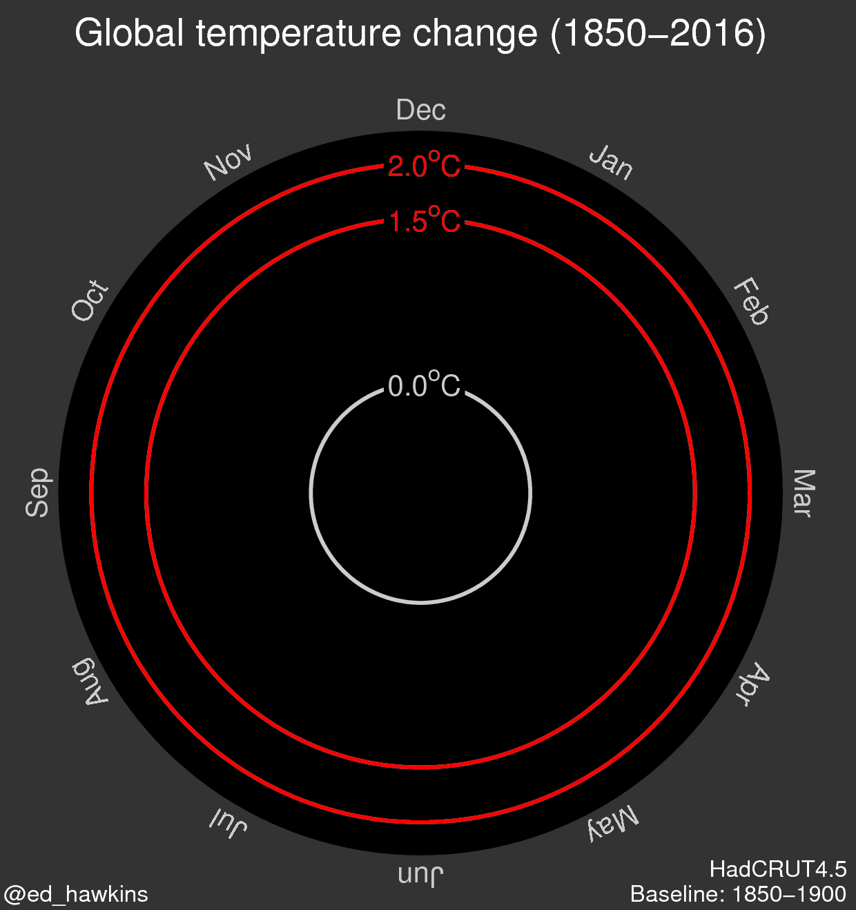
The first spiral depicts global temperature change (in degrees Celsius) from 1850-2016.
The second spiral depicts atmospheric carbon dioxide concentration (in parts per million) from the same period.

The visualization if effective in furthering the message of the reality of climate change. Rather than only have the radius depict the steadily increasing magnitude of global temperature and atmospheric carbon dioxide concentration, the color choices for the progression of the spiral from cool colors (such as blue, green) to warmer colors (such as yellow) reflects “global warming. The dynamic nature of this visualization encourages the viewer to engage with it more than a static visualization does. The speed at which the visualization iterates through the years reflects how fast the effects of global warming have come upon us, potentially pushing its viewers towards alarm and action.
However, this visualization could be made more engaging through interactivity. This could be in the form of a sliding bar that a user could manipulate to control what year at which to the viral is at.