The Education Gap

With the recent confirmation of Betsy DeVos for Education Secretary, equal access to education for everyone is once again a hot topic.  This New York Times article from April 29, 2016 addressed the issue.

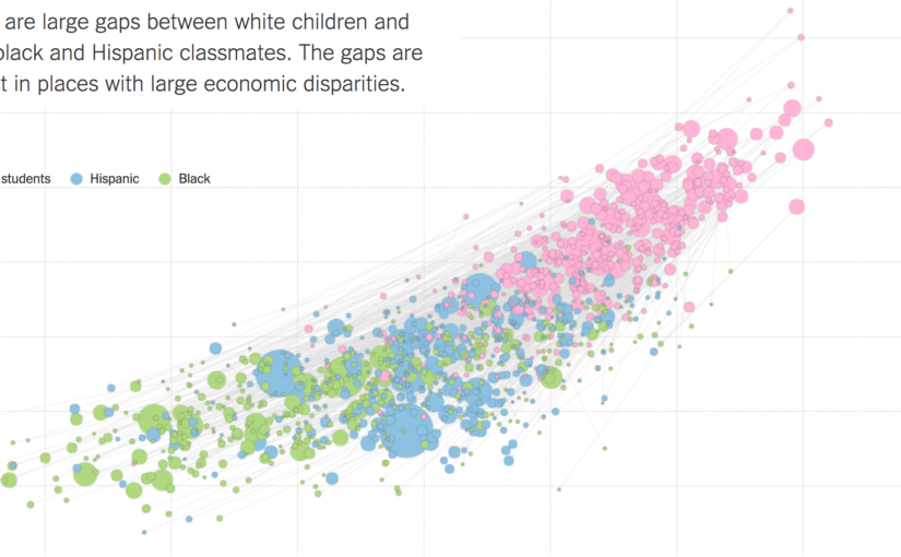
Although there were several graphics in this article, this one stood out the most to me.  This graph shows a student’s parents’ socioeconomic status on the x-axis, and their relative academic achievement levels on the y-axis.  The size of the dots represent the size of a racial group within a school district, and the color represents the specific racial group.  It is striking how white children seem to outscore minorities in a consistent fashion.  However, this data fails to control for geographical differences, or any other potential confounding variables.  Maybe white students tend to live in richer areas, which provide better education?

The next graphic in the article quickly debunks this idea.  Each line segment corresponds to a school district, which is more obvious in the interactive graphic when you mouseover a line segment and the district is displayed.  Even within a school district, white children consistently outperform their minority counterparts.

So why is this?  The article does not attempt to elevate any one explanation.  The intended audience is not clear, although the NYT does tend to gravitate towards more educated, liberal readers.  The goal does not seem to be to convince the reader to adopt one political position or the other, or even to explain the data.  Instead, it simply presents it.  By giving a clear, easily digestible picture of the data, the article allows the reader to make their own conclusions.  Whether this is desirable, or even responsible, is another question altogether.  However, it is clear that this is enough data to make anyone think about the underlying issues, and thus I believe the creator has succeeded in drawing attention to the issue, which was no doubt his original intention.  It is up to the reader to figure out why this phenomenon exists, and it is up to our generation to correct it, so equal opportunity is available for all.

Sean Soni

The Senate: More Divided than Ever?


Last semester, I took a course called IDS.012, or Statistics, Computation, and Applications. One of the topics that we focused on was network models, and the final project group that I was in decided to focus on the US Senate’s voting behavior over the last 25 years, focusing on if Senators have become more partisan in their voting habits over time.

During our project, we came across an interesting article by The Economist that had a great visualization of Senate voting behavior.

In the visualization, each Senator is represented as a vertex colored depending on their party affiliation, and edge (u, v) is assigned weight equal to the number of times Senator u and Senator v voted the same way (either Yay or Nay). How heavy a edge is reflects how close Senators are in the graph. This gives a great illustration of not only party voting trends, but also which Senators within a party vote similarly.

The article’s content and three graphs support and show that the Senate has grown increasingly partisan over the years. Given the article’s general description of the graph and algorithms employed, its intended audience appears to be the general US population.

We initially thought that the the graphs were very effective at illustrating the increased polarization of the US Senate, but when we did our own exploration of the data (found at govtrack.us) and looked into the means of which the graph was generated, we found that certain measures were taken to overstate the increased polarization.

The original author of the graphs decided to omit all Senators who voted similarly fewer than 100 times. If these edges were included, 2013 didn’t look as drastically different from 1989. By looking at other metrics that look at divisiveness, such as modularity, we found that the truth was quite different from what the article told.

In the chart below, modularity is plotted per year. A higher modularity score corresponds to a more divided Senate. The red dots indicate the years chosen to illustrate the trend.

The year 2002 was selected to best support the narrative that “the Senate is more partisan than ever before.” The reasons news companies do this range from “we didn’t do our due diligence” to a more dubious “this article, while not completely factual, will generate more clicks and traffic to our site.”

In conclusion, I believe that the article was effective at selling their story of a more divided Senate, but failed to show the overall picture of congressional voting trends.