I was reading about the recent selling of IPv4 addresses by MIT to Amazon and in some of the discussion a rather old but classic data visualization popped up:
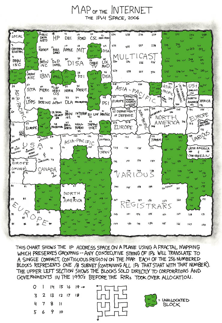
This is, of course, the xkcd “map of the internet”. The data that is being shown is which entities own certain IP address ranges: essentially blocks of the internet. For example, in the data visualization we see that MIT owns IP prefixes that start with 18.
The audience of this is the same as the usual audience to xkcd, which is very broadly speaking nerds on the internet. The goal of the presentation I think is to show that relatively few players control the whole internet; you’d think that with there being over 4 billion possible IP addresses there would be a lot of freedom but in reality there are only around 100-200 players who own everything and license out IPs to others.
I think the visualization is effective given the target audience. To a general person, this is probably too cluttered because so much data is being shown. However, as xkcd viewers are generally “nerdier”, they will be willing to spend more time to investigate and thus that issue wouldn’t immediately discredit the visualization. The fractal mapping explained at the bottom is an efficient way to compress the previously 256 data points to a 16 x 16 square while still keeping contiguous regions together (so for example, the blocks Europe owns are all grouped together) which greatly enhance readability given the constraints they’re working with. Probably the only glaring flaw I’d say is this is outdated; this was made 11 years ago and the IP address layout has changed quite a bit, so it shouldn’t really be used as a discussion point today anymore. However, in its time I think it did a great job given the target audience and the data it wanted to present.