With a new year comes new years resolutions, and my personal goal of eating healthy recently lead me to explore a new app called Lose it. One of its features gives users visuals of how large servings sizes are for various food groups. Like any other food-tracking app, you can enter in what you ate and how much you ate, but Lose it tries to help you gauge portion sizes with graphics like the one shown below.
Lose it appears to be marketed towards a younger, modern audience that wants to track their food consumption and lose weight. The app is filled with bright colors, sans-serif fonts, and motivational weight-loss phrases. The goal of the infographic, as well as the entire app, is to convince users that calorie-counting can be simple through Lose it. Remembering what items you’ve eaten in a day is hard enough, but knowing how many cups or grams of each food you consume is harder.
Lose it presents serving size data very effectively. Cups and grams are difficult for most people to gauge. I have seen various other attempts at visualizing serving sizes and few have been as effective as the ones in Lose it. Others generally compare food servings to lesser-known objects (ex: one bagel serving is the size of a hockey puck) which are still hard to understand. Lose it makes an effective presentation by using common objects (eggs, golf balls, baseballs) for comparison and including a picture of the food next to the object for reference. Combined with an easy-to-use UI, Lose it’s graphics make serving-counting much simpler.
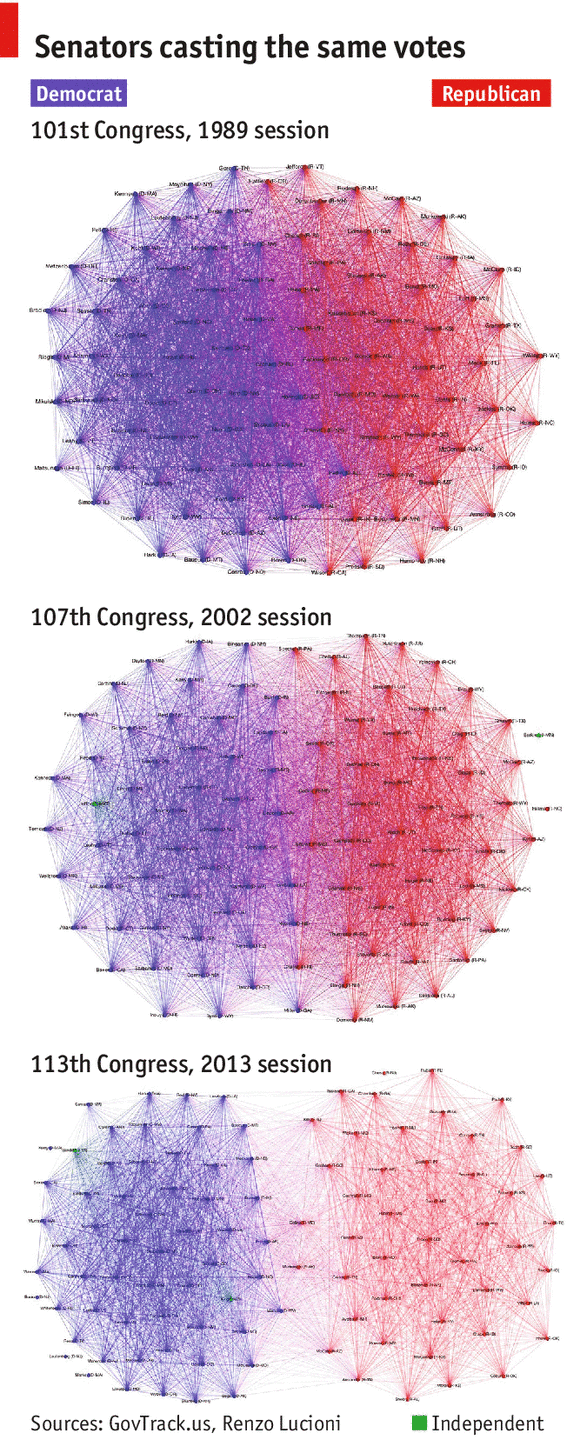
Last semester, I took a course called IDS.012, or Statistics, Computation, and Applications. One of the topics that we focused on was network models, and the final project group that I was in decided to focus on the US Senate’s voting behavior over the last 25 years, focusing on if Senators have become more partisan in their voting habits over time.
In the visualization, each Senator is represented as a vertex colored depending on their party affiliation, and edge (u, v) is assigned weight equal to the number of times Senator u and Senator v voted the same way (either Yay or Nay). How heavy a edge is reflects how close Senators are in the graph. This gives a great illustration of not only party voting trends, but also which Senators within a party vote similarly.
The article’s content and three graphs support and show that the Senate has grown increasingly partisan over the years. Given the article’s general description of the graph and algorithms employed, its intended audience appears to be the general US population.
We initially thought that the the graphs were very effective at illustrating the increased polarization of the US Senate, but when we did our own exploration of the data (found at govtrack.us) and looked into the means of which the graph was generated, we found that certain measures were taken to overstate the increased polarization.
The original author of the graphs decided to omit all Senators who voted similarly fewer than 100 times. If these edges were included, 2013 didn’t look as drastically different from 1989. By looking at other metrics that look at divisiveness, such as modularity, we found that the truth was quite different from what the article told.
In the chart below, modularity is plotted per year. A higher modularity score corresponds to a more divided Senate. The red dots indicate the years chosen to illustrate the trend.
The year 2002 was selected to best support the narrative that “the Senate is more partisan than ever before.” The reasons news companies do this range from “we didn’t do our due diligence” to a more dubious “this article, while not completely factual, will generate more clicks and traffic to our site.”
In conclusion, I believe that the article was effective at selling their story of a more divided Senate, but failed to show the overall picture of congressional voting trends.
Ventusky is a weather visualization platform developed by ImMeteo, a Czech meteorological company who focuses on weather prediction and meteorological data visualization.
Figure 1 Ventusky interface
Ventusky presents worldwide weather maps including wind, rain, temperature, air pressure, etc (Figure 1). It has weather data of the past week and can play the timeline as a progress bar to show the weather change. Ventusky supports users looking up for cities/provinces and provides them with detailed information (current weather, weather forecast, sun and moon info, etc) about the cities/provinces (Figure 2).
Figure 2 Detailed weather information about Boston in Ventusky
Audience of Ventusky can be anyone who is interested in knowing the weather information (current or past) in some places. They can be passengers of flights or backpackers checking the weather in destinations, residents who wish to know the affected area of snowstorm, or even researchers who want to see the current weather or recent weather change.
In my view, Ventusky aims to provide users with up-to-date worldwide weather information through an intuitive map interface. It serves as a platform for users to look at current weather, weather change, and weather forecast in a visualization method but not the conventional way – reading text. By providing multiple features (temperature, air pressure, clouds, etc) that can be integrated in the visualization, it also fits users’ need to look at various weather features in one interface.
In fact, the first wind map I saw is not Ventusky, but this one below (Figure 3). The wind map in Figure 3 is concise, beautiful, and does a good job in presenting flow animation, but not as effective as the Ventusky one. Ventusky not only displays wind map but also other weather features such as temperature and clouds, the combination of which makes the visualization more informative. Moreover, the detailed information such as weather forecast for specific cities/provinces not only makes it helpful to a wider range of audience but also makes sure Ventusky has the value to be revisited by users. Last but not least, the history weather data and play-timeline function also add value to Ventusky.
Figure 3 Another Wind Map
In terms of meteorological data, maps are good presentations since they provide an intuitive view by allowing users to see weathers of different places at one time. Compared to printed map, online maps also do a better job in providing interactive interfaces and allowing zoom-in/out for detail checking. In that way, Ventusky seems to be an effective platform for weather visualization.
However, I feel the color map is a little difficult to read in some circumstances. For instance, when selecting temperature as a feature, the colors for -10°F and 80°F look similar in the map, making some area in Canada and Mexico in almost same color. Another thing may be interesting to consider is whether it’s possible for users to select any two features they are interested in to present in the interface. Currently one feature is fixed to wind and users can change the other feature.
No Ceilings: The Full Participation Project was a project done by Fathom studio for the Gates and Clinton Foundations as part of the 20th year anniversary of the UN’s movement to promote international gender equality. The project focuses on several visualizations of different datasets regarding gender inequality. These are of various sizes and complexities.
The homepage features a large visualization that draws the user in to interact with. It shows the gap of men and women in the workforce in different countries. I like how familiar and chart like it looks, but its design is still very striking and the interactivity is seamless.
There are also mobile visualizations, which are also quite striking. For example, this one looks at child bride rates in different countries. While it is simple, it’s very effective and engaging.
This same visualization can be shown on a desktop.
There is also a map where you can see several different visualizations. This is both on mobile and desktop and serves as a control panel for many of the datasets that have their own visualizations.
Overall, this website is meant for a wide range of people, but specifically geared towards younger people (thus the stress on mobile visualization) and policy makers. I found it very effective because not only are the visualizations appealing they are also quite layered and have a natural flow for the user to follow the story and delve deeper into the data. And the power of focusing on multiple platforms is definitely very effective in terms of practicality.
This past IAP, I worked in the new data science group at Maersk Line, the biggest shipping company in the world. One of my coworkers found Shipmap.org, which lets you interact with GPS timeseries data for cargo ships in 2012.
I enjoyed this data representation because it conveys many complexities of global trade without overwhelming its audience: the general internet-using population. On my first glance, the site displayed an aesthetically pleasing bathymetric map that showed global ship movements. However, more aspects quickly began to show through. I zoomed in on choke points, such as the Egyptian Suez Canal, the Panama Canal, and even the area around Singapore. The busiest world ports glowed, which actually helped inform my forecasting work the next week. Even unrelated facts such as the Earth’s curvature show in the ship movement–look at the route from the Vancouver to East Asia. The toggles also allow you to view different cargo types, CO2 emmissions, etc., so I feel like I always learn something new when I visit.
Even though this visualization displays fairly raw data, it does a great job of entertaining and informing: what I perceive to be its two main goals. The map’s interactivity entertains users by letting them discover their own inferences, and the map provides a natural way to deeper explore these inferences. These personal conclusions result in a much higher-impact experience than simply seeing charts showing CO2 emissions, cargo flows, etc. The inferences bring the user into the data, personally connecting them to the data’s story.
I recently came across a detailed analysis by Todd W. Schneider of 1.1 billion New York city cab rides that occurred from 2009– 2015. In addition to this massive dataset provided by the New York City Taxi & Limousine Commission, Schneider also incorporated a public dataset of 19 million Uber rides from April– September 2014 and January– June 2015.
One of the most striking images from his analysis, showing a heatmap of taxi pickups and dropoffs in NYC.
This analysis appears to be intended for New Yorkers, as a lot of the analysis and visualizations assume the audience has basic geographic familiarity with NYC and an understanding of New York lingo and culture. While this presentation would definitely still be interesting for those interested in transportation and unfamiliar with NYC, Schneider focuses less on general transportation analysis (eg. average fare or trip time) and more on New York specific analysis (eg. which neighborhoods are up late and taxi trips taken from Goldman Sachs).
Schneider appears to have multiple goals in this presentation. One is to comprehensively explore a wide variety of questions in this data set. He includes numerous graphs and figures, each addressing a different aspect of the dataset, but it’s almost overwhelming how many figures are presented. Though data junkies would enjoy the comprehensive nature of this presentation, I think most readers will get overwhelmed by sheer number of graphs. In addition, in my opinion, the large number of figures buries some of the most interesting aspects of the data, reducing the efficacy of his analysis. For instance, about halfway down his (long) post, Schneider has a simple bar graph showing that rainstorms don’t appear to affect daily ridership. This was the most surprising conclusion for me personally, as the common thought is that taxis are impossible to get during rainstorms, so the fact that it’s hidden halfway down his post is disappointing.
A simple graph showing that rainstorms don’t appear to affect daily NYC taxi ridership.
Intentionally or not, he also appears to be advocating for usage of public transit over taxis in parts of his analysis. In the section dedicated to airports, he concludes that “depending on the time of day and how close you are to a subway stop, your expected travel time might be better on public transit than in a cab, and you could save a bunch of money.” As New Yorkers can then customize the visualizations to show expected travel time to the airports from their own neighborhood, I think this part of the presentation is very effective. It’s much more powerful and relatable to show viewers time averages of taxi trips from their own neighbourhood rather than averages across the whole city, making this section of analysis one of the most powerful in the whole presentation.
The “Our World In Data” website provides a visualization of global energy production over the past two centuries. The data is broken down into specific energy sources and shows how their composition has changed over the years as the primary energy source transitioned from “Biofuels” in the 19th century to “Crude Oil” for much of the 20th century.
This chart shows how our energy production has changed over the last century and shows the gradual adoption of renewable energy sources in recent decades. This visualization is effective in the sense that it presents the data in a clear, understandable form.
In the expanded mode, viewers can see what percentage of the global energy production comes from each energy source, although this view does hide the awe-inspiring near-exponential growth in energy consumption over time. It shows the slight dip in nuclear energy more clearly than in the previous view and makes viewers wonder if this trend is likely to continue – many nuclear reactors have been shut down in recent years due in part to safety concerns and cheaper natural gas.
This graphic appears to be intended for the general public and does not advocate for any particular energy policy. The goal seems to be to simply present the raw data to a wide audience, allowing the viewers to draw their own conclusions regarding what the future for energy sources will look like.
This infographic presents data related to American sugar consumption and its health consequences. The original can be found at http://www.coolinfographics.com/blog/2012/8/29/american-sugar-consumption.html.
Brandon Levy
Given my interest in nutrition, I often come across data presentations that address Americans’ consumption of various sorts of food, many of which focus on sugar. This infographic, titled “Nursing Your Sweet Tooth,” includes multiple data presentations that display information about Americans’ sugar consumption. Given the shocking nature of some of the images in the infographic, its intended audience appears to be Americans who either are not aware of the incredible quantity of sugar consumed in the US and the associated health effects or don’t really care about these issues. The shocking images – such as one showing a mouth eating ten strips of bacon, the caloric equivalent of the average American’s daily sugar consumption – are probably intended to persuade people who are not particularly health-conscious that consuming lots of sugar is unhealthy and that they should cut back on their sugar intake.
The infographic shows a variety of data, including how much sugar the average American consumes each year and every five days; how many 12-ounce sodas that equates to; how much sugar people should be consuming compared to what they actually consume; what kinds of foods provide Americans’ with most of their sugar intake; and how many calories from sugar the average American consumes daily. As I said before, the shocking nature of some of the images strikes me as very convincing, although they may turn off some people who don’t want to acknowledge the reality of their sugar consumption. In addition, some of the data presentations are a bit arbitrary, such as the one that compares 5-day average sugar consumption in the modern day with (for some unclear reason) the year 1812. But I do think the use of familiar food items like 12-ounce sodas, pop tarts, and Twinkies to represent certain quantities of sugar, along with bacon to represent the calories in sugar, makes the infographic much more accessible and intelligible to a lay audience than it otherwise would be.
Interested in taking this course? Check out some of the projects from last year if you are curious about the type of things you will build and learn.
Unfortunately due to the design of the course I have to limit enrollment to about 25 people. I prioritize enrollment based on seniority, affiliation, and background. So if you are a grad student or upperclassman, from MIT/Media Lab/CMS, and bring a unique skill among the student set, then you are more likely to obtain admission. I will get back to you before Thursday on whether you are in or not.
Fill in the enrollment request form by Tues at 5pm. You’ll hear back from me by Wed 1pm indicating if you are in or not.
This is the shared class blog for the CMS.631 / CMS.831 Data Storytelling Studio course at MIT (Spring 2017). Many of your homework assignments will require you to submit blog posts here. Feel free to cross-post them to your own blog. Much of the conversation about data, finding stories, creating presentations, and creating change happens online; you need to add your voice to that conversation if you plan to do this type of work.