The Story of California’s Drought

I’m from Southern California, and one of the biggest issues in the state recently has been the drought. This series of 259 drought maps shows the drought level in the state of California from December 2011 to February 2017.

At the top of the visualization is a legend assigning a color to different drought levels:

Legend

The drought maps are then displayed chronologically in a grid, left to right and top to bottom.

The sheer amount of red on the maps in early 2014 helps viewers easily understand how dire the situation was and why Governor Jerry Brown declared a State of Emergency in January 2014:

Early 2014

Scrolling to the year 2015, California is mostly dark red, indicating a level of “Exceptional Drought”. The shrinking of dark red areas in the spring 2016 maps show that the drought is improving. And then in early 2017, only a small part of California is dark red and in extreme drought:

Early 2017

This visualization clearly tells the story of California’s drought. The yellow-orange-red color scheme connotes fire and heat, which is strongly correlated to drought, and the color gradient for different drought levels reflects light/dark color connotations in society. The viewer can easily identify the year corresponding to the maps, and a date pops up when the viewer hovers over a particular map. Being able to instantaneously see maps from different times really helped me understand when the drought got worse, how bad it was, how long California was in “Extreme Drought” for, and how impactful the storms last month were.

Although the viewer may get lost in the rows of red/orange/yellow sock-like shapes, I think the designer’s choice to lay out the maps really serves its purpose of guiding the viewer through the story of California’s drought. If the designer had used a single map and a scrollbar that, when dragged, alters the map to reflect the drought over time, some parts of the story might have been lost in the time-lapse because the viewer would only be able to make immediate comparisons. This data presentation relies on color connotations and a series of snapshots to enable Californians, people interested in climate change, and others curious about the drought to better understand how drought levels changed in California in the past 4 years.

Data Log for February 10th, 2017

  • Woke up and left my room. Recorded by cameras and wireless signal logs.
  • Checked email, news, other misc. websites which were tracking me.
  • Ate lunch/dinner at Maseeh by swiping my MIT ID.
  • Wrote some code for my UROP project, uploaded a new dataset to Dropbox.
  • Returned a book at the COOP, refunded to my credit card.
  • Watched videos and did exercises on MITx.
  • Picked up a package at the front desk, recorded by their system.
  • Used my MIT ID to print at Athena cluster.
  • Scanned a few pages from my notebook into Google Drive.

Sean Soni’s Data Log

  • 10:30 AM – Added course staff emails and phone numbers to 6.042 staff website
  • 11:00 AM – Uploaded staff personal websites to 6.042 student website
  • 1:15 PM – submitted form to 6.03 staff indicating schedule
  • 1:30 PM – added PE course into my Google Calendar
  • 2:00 PM – created neighborhoods on SimCity
  • 3:30 PM – entered credit card information into Eat24 for food delivery
  • 5:45 PM – wrote this blog post
  • 6:15 PM – emailed professor to ask about adding category for assignment
  • 6:45 PM – placed trade on Robinhood
  • 8:30 PM – edited more staff info on 6.042 website
  • 9:45 PM – edited htaccess file for 6.042 repo
  • 10:30 PM – submitted this blog post

Crazy Things That Are Illegal (And Legal) To Do In A Car

Have you ever wonder whether driving while wearing headphones is legal? Or if you can drive barefoot?. All these questions and more can be answered through an interactive visualization platform called “Is it illegal to Drive ..?“. The platform uses a nice map to provide the answer to the most-Googled questions about driving laws in the US. It is developed by Just Park to show the inconsistencies in U.S. driving laws.

The platform lets you click on an animated map of the United States with bubbles for each state. As the headline question changes, the bubbles change color to show whether an action is legal (green), inadvisable (yellow), or illegal (red.)

Inadvisable activities can possibly get you in trouble, depending on the discretion of a traffic officer. My advice is if you see anything not green, just avoid doing it. That includes, for example, driving while tired or barefoot.

Also, one of the most surprising facts in this mini-site, that driving your car with a beer in your hand will not get you cited as long as you are under the legal limit in Mississippi. You can find several interesting driving facts on the platform, and if you want to fact-check the numbers, there is a Google Docs spreadsheet with all the sources.

In the US, finding driving laws is not simple, since it depends on in which state you are in. The goal of this interactive platform is to speed up the process of finding answers by visualizing what is against the law and what isn’t in each state. In that way, people can find their answers and gain more knowledge about the driving laws in general in the US. This platform is intended for a broad range of people, so the use of interactive visualization is an efficient way to enforce laws. Also, it encourages people to know their rights without having them to read endless documents.

In the end, stay away from New Jersey, unless you want to speed past a funeral procession while wearing headphones, and with a missing front bumper car.

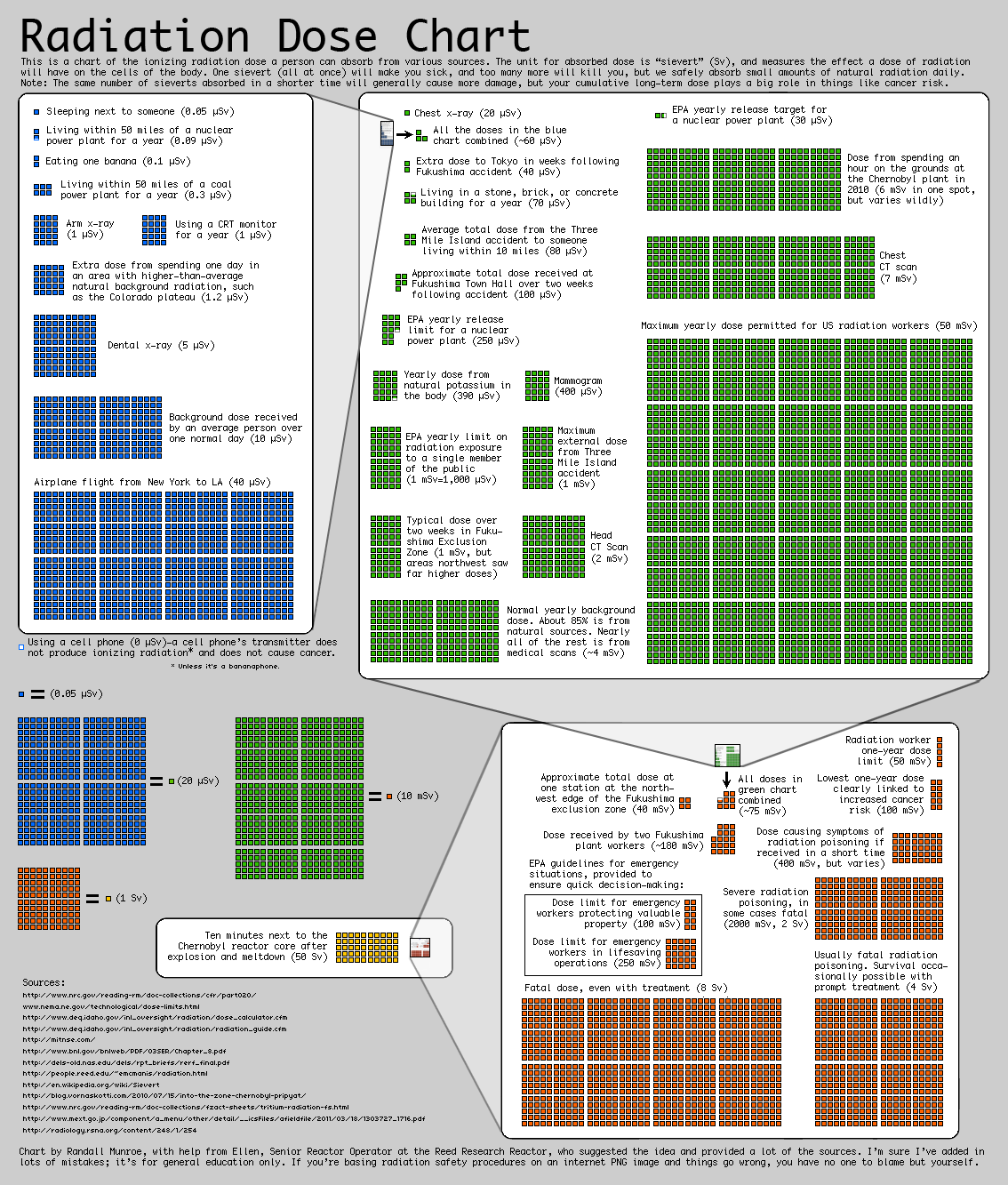
Radiation Chart

A while ago I came across this chart by Randall Moore, the creator of the webcomic XKCD. The chart aims at representing the average ionazing radiation dose due to different sources. As explained in the top of the chart, the radiation dose is measured in sieverts (Sv). The sources reported range from regular activities, such as airplane flights or medical procedures, to doses due to carastrophic events such as Fukushima and Chernovyl.

The main objective of the visulization, however, is not just reporting the absolute values of this sources but representing their relative strengthThe graph tries to make really apparent the different orders of magnitude of the different doses, which is a concept often difficult to graps when just a number is reported.

I think the visualization uses some effective techniques, such as embedding the previous order of magnitude chart into the next to clearly represent their relative importance. However, I think the chart as a whole is not as clear as it could be. There is a significant amount of text, and the goal of the visualization is not inmediatly clear upon first inspection. I also think the layout could be improved by placing each order of magnitude either above or below the other one, to create a linear path for the viwer to follow.

The chart is directed to a general audience, although to understand it’s relevance you have to already know what radiation is.

Are You As Smart As You Think?

What makes data presentations really powerful, is when users are not only passive consumers. I recently found a striking example for that. It´s a New York Times article called “You Draw It: What Got Better or Worse During Obama’s Presidency”. It shows how indicators of key policy issues developed during the Obama years: e.g. national debt, unemployment rate, number of crimes or troops abroad.

Readers are shown the data for the Bush years (2000-2008). They then can get active and draw what they think might be the line for Obama´s time in office (2008-2016).

In a second step, you are presented with the actual data (blue line) and some additional explanations.

I think this presentation is made for a broad general audience, for readers that are willing to test their own perception against the actual facts. Or as the NYT puts it: “See if you’re as smart as you think you are.”

This piece was published after the November election and before the inauguration of Donald Trump. I see two main goals the authors tried to achieve: first of all, it helps readers assess the performance of the Obama administration on the basis of hard facts. Secondly, it confronts readers with their own potential misjudgments.

Was it effective? I personally was very much attracted by this playful and interactive approach towards stats. I am not sure whether I would have read an article on that topic with just static charts.


Quarterback Pocket Pressure

In a recent article leading up to the Super Bowl, the New York Times used visuals from Second Spectrum analytics to highlight the impact of quarterback pressure on performance. The first visual highlights the disparity between completion percentage for quarterbacks when under pressure versus with a clean pocket to throw from. The visual compares this disparity for all thirty two NFL quarterbacks benchmarked against the league average and particularly highlights the Patriots and the Falcons. The Patriots fall from the fourth ranked to the sixteenth ranked team under pressure while the Falcons only drop from second to fourth.

This comparison leads into the next visual which uses new data released by the NFL to create a heat map showing defender traffic around the pocket in games Brady and Ryan both lost. The graphic also shows the average defenders in the pocket per snap benchmarked against the league average and team average. This element of the visual allows readers to better quantify the significance of the heat map.

These visuals aim to show that while pressure significantly effects the performance of all NFL quarterbacks, Tom Brady is particularly susceptible. Thus, a game plan designed to focus on pressuring Brady is the optimal strategy for the Falcons to defeat the Patriots in the Super Bowl. This data presentation was intended for readers who wanted a deeper analysis of the upcoming Super Bowl, and was successful in doing so by using a new data set to draw an intriguing comparison on the games key players.

What Would It Take To Turn Blue/Red States Red/Blue?

Over the course of the last two years, I have become much more interested in politics, particularly the election strategy process. For example, there are so many small ways candidates/parties can influence outcomes by targeting their messaging by demographic, or working to increase/decrease voter turnout in certain regions. In learning more about political issues and this process, I’ve turned to fivethirtyeight, as they often have amazing interactive graphics and aggregate data from many different resources in their models, but target an audience with some education about data analysis.

This interactive visualization allows users to adjust voter turnout percentages and political leanings by demographic, and shows the resultant electoral college map, based off of 2012 election data scaled for population changes. When I came across this graphic a few days ago, I thought it was the perfect tool to test my assumptions about certain demographics. I did this with my thoughts on my home state of Michigan, which usually goes blue, but went red in this election. I decreased black voter turnout a bit, and increased the republican leaning and voter turnout for non-college-educated whites, the two factors which are being most attributed to Trump’s winning of Michigan’s electoral votes. This was just enough to flip Michigan to red, and flipped Pennsylvania and Wisconsin as well, both key states that went red in this election.

This interactive is probably most targeted towards people with a good grasp of the electoral college and specific hypotheses they want to test regarding this past election. It does provide a clean interface for learning about the demographics, both in this aggregate method and on a state-by-state basis further down the page. However, I think it would be more effective with some more demographic factors such as age range. The interactive was also published in October before this election outcome, so having a revised section post-election with the updated data on these percentages of voter turnout would create more relevance and make it more accessible to a wider audience.

A World of Change

This Google Trends interactive shows how searches reflect the way people from around the world think about climate change. It displays search volumes in 20 major cities from 2004-2015, for topics such as energy, recycling, oceans, air pollution, and other words and phrases that relate to the environment.

After selecting a topic, the geometric globe rotates as searches from around the world are displayed. The letters in the searches appear one after another, creating a typing effect. Each search covers roughly the size of an entire continent on the globe, making the globe seem like a small, intimate space, instead of an incredibly vast planet.

You can also click on specific cities and learn more about that city’s concerns regarding a certain environmental topic.

According to Simon Rogers, a contributor to the interactive, the goal was to take Google’s enormous amount of data (there are over 3 billion searches a day) and “make those huge numbers meaningful.” The interactive accomplishes this goal by presenting a snapshot of searches and allowing the user to explore specific topics or cities in just enough detail to pique their interest, but not too much to be overwhelming.

This interactive is geared towards casual views who are interested in learning more about attitudes towards climate around the world at a high level. The interactive isn’t targeted at people who are already experts in this domain or people who want to dive deep into data analysis.

The Political Compass

Last semester, I studied voter advice applications. More specifically, I dug into the methodologies used by these applications to recommend political candidates based on the users’ political stances. Most applications provided a ranked list of recommended candidates at the completion of the questionnaires, but a website called The Political Compass took a more passive approach.

The Political Compass represents one’s political ideology through coordinates on a two-dimensional scale, with one axis representing the social spectrum and the other representing the economic spectrum.

This two-dimensional scale represents the different combinations and degrees of political ideology.

After taking their questionnaire, I can see where I’m placed on their ideological scale, as well as where candidates and world leaders are placed. I notice my coordinate position is close to those of certain candidates, which means The Political Compass concluded that those candidates and I share similar ideologies.

After completing the questionnaire, users are placed on the scale to determine their political ideology.
This is how “The Political Compass” places 2016 U.S. Presidential Candidates on their scale.

This implicit conclusion sends the message that I ought to view those candidates more favorably, and that people on similar positions on the scale are similar in ideology. I can imagine this process elicits varying reactions from users—I’d personally feel a bit upset if my coordinate position was close to Hitler’s. Not to mention, these results present a metric for candidate-to-candidate and candidate-to-user comparisons, which can either confirm or contrast one’s preexisting opinions about the political arena.

Applying the liberal/conservative spectrum to the economic/social axes seems to overly simplify the meaning of ideology, but people do seem to view political stances through binary lenses. Including other factors or dimensions would hopefully signal a shift away from a polarizing approach to politics.