Super Bowl LI

In preparation for Super Bowl LI, I was researching the game to understand the dominance of this sporting event and subsequently stumbled across this infographic produced by WalletHub. The infographic is subdivided into multiple sections; Super Bowl LI, Game Day Notes, Media Extravaganza, Ticket Prices, Super Bowl Ads, Pigging Out at Pigskin Parties, Big-Game Betting, and Super Bowl Economics. Below each section is 3-8 different statistics overlaid on an image.

The audience of this data presentation is sports fans, or at the very least those who have some interest in sports. The statistics present are unconnected, and to be best understood, require some sporting knowledge. This is why I believe the targeted audience is those who are interested in sports.

By providing statistics in a variety of categories that pertain to the Super Bowl, the data presentation aims to convey the magnitude of the game and therefore increase interest in the game. By presenting the massive reach of the game in the form of an infographic readers who do not normally watch the Super Bowl may have a new interest and join the bandwagon by viewing the game. The effectiveness of this data presentation in limited by the lack of comparison for the numbers. For example the infographic lists “70 total cameras used by Fox Sports”. Based on the context of this infographic, one will probably assume this to be a large number, but the reader does not know how many cameras are used in a regular season football game, TV show, blockbuster movie, or another sport. If a comparison was provided, readers can better appreciate the statistic and thus better evaluate the reach of the Super Bowl.


Source: https://wallethub.com/blog/super-bowl-facts/1589/

Note: Apologies for the low-quality image. I did not realize the quality until I made the post. The link provides a high quality visual.
The Education Gap

With the recent confirmation of Betsy DeVos for Education Secretary, equal access to education for everyone is once again a hot topic.  This New York Times article from April 29, 2016 addressed the issue.

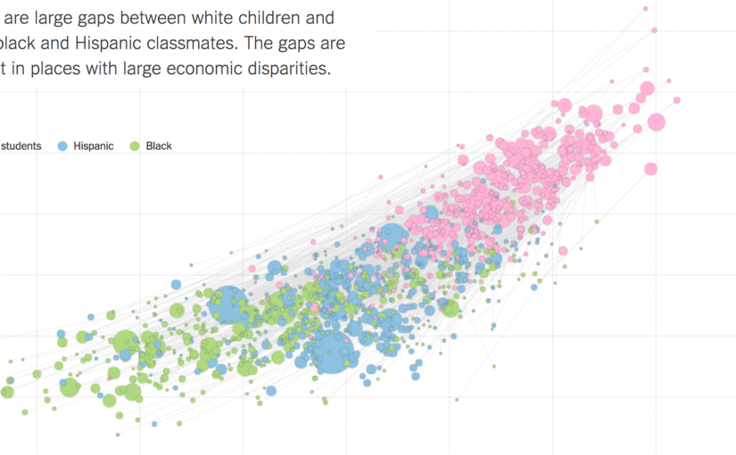
Although there were several graphics in this article, this one stood out the most to me.  This graph shows a student’s parents’ socioeconomic status on the x-axis, and their relative academic achievement levels on the y-axis.  The size of the dots represent the size of a racial group within a school district, and the color represents the specific racial group.  It is striking how white children seem to outscore minorities in a consistent fashion.  However, this data fails to control for geographical differences, or any other potential confounding variables.  Maybe white students tend to live in richer areas, which provide better education?

The next graphic in the article quickly debunks this idea.  Each line segment corresponds to a school district, which is more obvious in the interactive graphic when you mouseover a line segment and the district is displayed.  Even within a school district, white children consistently outperform their minority counterparts.

So why is this?  The article does not attempt to elevate any one explanation.  The intended audience is not clear, although the NYT does tend to gravitate towards more educated, liberal readers.  The goal does not seem to be to convince the reader to adopt one political position or the other, or even to explain the data.  Instead, it simply presents it.  By giving a clear, easily digestible picture of the data, the article allows the reader to make their own conclusions.  Whether this is desirable, or even responsible, is another question altogether.  However, it is clear that this is enough data to make anyone think about the underlying issues, and thus I believe the creator has succeeded in drawing attention to the issue, which was no doubt his original intention.  It is up to the reader to figure out why this phenomenon exists, and it is up to our generation to correct it, so equal opportunity is available for all.

Sean Soni

The Climate Lab Book’s Climate Spirals

The Climate Lab Book is a blog that is “an experiment in ‘open source’ climate science.” Written by climate scientists with the purpose of “promoting collaboration through open scientific discussion,” it features a variety of data visualizations, resources, and perspectives–all scientific.

Currently, it features “Climate Spirals” that depict how climate change has, in a way, spiraled out of control over the last several decades. Although the blog’s purpose is to engage in scientific discussion, the visualization is accessible to more than just scientists, and seems to help people realize the reality of climate change.

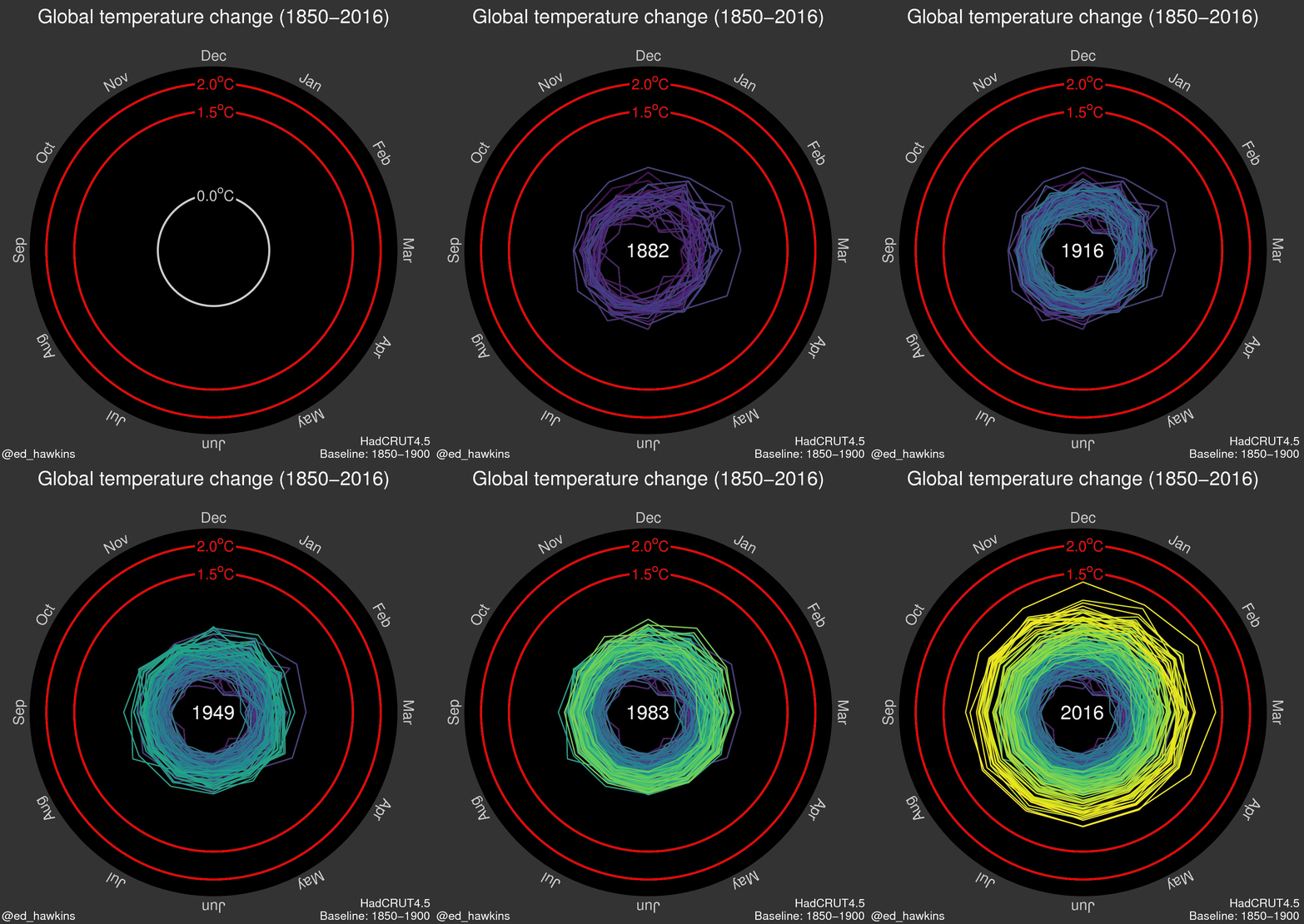
The first spiral depicts global temperature change (in degrees Celsius) from 1850-2016.

The second spiral depicts atmospheric carbon dioxide concentration (in parts per million) from the same period.

The visualization if effective in furthering the message of the reality of climate change. Rather than only have the radius depict the steadily increasing magnitude of global temperature and atmospheric carbon dioxide concentration, the color choices for the progression of the spiral from cool colors (such as blue, green) to warmer colors (such as yellow) reflects “global warming. The dynamic nature of this visualization encourages the viewer to engage with it more than a static visualization does. The speed at which the visualization iterates through the years reflects how fast the effects of global warming have come upon us, potentially pushing its viewers towards alarm and action.

However, this visualization could be made more engaging through interactivity. This could be in the form of a sliding bar that a user could manipulate to control what year at which to the viral is at.

NBA Math – Quick and Comparable Information

I’m definitely an avid NBA fan and a lot of the accounts I follow on Twitter are geared toward providing me with information about the league and the teams I like to keep track of. One Twitter account that I found just a few weeks ago, NBA Math, tries to provide an objective assessment of the league by crunching numbers, specifically through their TPA model that takes into account a per possession conversion of the events that occur throughout the course of games.

Their TPA model often provides a two-number evaluation of players and teams that can be broken down into an offensive and defensive score. Viewing these computations in a table ordered by greatest difference can be a great way to visualize most of the information one would want, but makes comparing quite difficult and tedious.

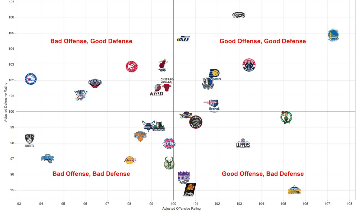
Many of the tweets they send overcome this by displaying the teams on a simple x-y coordinate graph where the axes represent the offensive and defensive scores.

Adjusted defensive and offensive scores for each NBA team since 1 January 2017 VIA NBA Math

While the aesthetics of the display may be bland, presenting it this way is incredibly powerful and allows a Twitter user to be able to make the quick assessments that are typically favored on a social media platform. They are on the site to get quick bursts of information and this type of data platform allows a single tweet to streamline a lot of information at an incredibly rapid rate. Seeing how various teams positions differ can be done with great ease, allowing a user to identify where there team stands and how they might need to improve relative to the rest of the league and the teams that, by popular opinion, are considered elite.

It’s very unclear how effective a model that tries to boil down performance into two numbers can be useful and effective. However, the ability of NBA Math to send out bursts of tweets in this variety can capture the attention of Twitter users easily allowing them to show off this model and try and convey the information they’re gathering about the league.

Link to Tweet: https://twitter.com/NBA_Math/status/829369301899567104

Bloomberg’s Cabinet Graphic

For the past two years, Bloomberg has been publishing interactive data graphics. I first found them in 2015 after reading their post on climate change. Since then, they posted many more, mostly about politics and finance. A more recent one is about Trump’s cabinet nominees, titled “Trump’s $6 Billion Cabinet: Mostly Men, Mostly White and Not Much Government Experience”.

The data presentation takes the form of two tables: one that compares Trump’s cabinet nominations to the previous two presidents (top picture), and one that gives more detailed information about each nominee (bottom picture). The graphics take special notice of the race, gender, government experience, military experience, and wealth of each cabinet member/nominee.

As the title suggests, the goal of the presentation is first to highlight the similarities and differences between Trump’s cabinet and previous cabinet (his cabinet has roughly the same diversity as Bush’s, but far less government experience than both Bush and Obama), and also to educate viewers about the nominees and cabinet members (achievements, past boards, recent news, public stance on issues, wealth). The categories it chooses effectively reveal a stark contrast between past and proposed cabinets, and the extra information in the table along with the related links for each nominee make it a useful tool to become informed about each person. The experience is a little diminished by the weird scrolling behavior.

The graphic is catered to casual viewers – people who maybe do not follow every political announcement but want a brief overview; a lot of the information would be redundant to people who follow politics vigorously, although the tables give a concise summary that may be good for reviewing.

Overall, Bloomberg’s graphic about the cabinet effectively informs viewers about Trump’s new cabinet – how it’s compares to previous ones, who is on it, and what to expect from the members.


Lose it – Gauging Portion Sizes

With a new year comes new years resolutions, and my personal goal of eating healthy recently lead me to explore a new app called Lose it. One of its features gives users visuals of how large servings sizes are for various food groups. Like any other food-tracking app, you can enter in what you ate and how much you ate, but Lose it tries to help you gauge portion sizes with graphics like the one shown below.

Lose it appears to be marketed towards a younger, modern audience that wants to track their food consumption and lose weight. The app is filled with bright colors, sans-serif fonts, and motivational weight-loss phrases. The goal of the infographic, as well as the entire app, is to convince users that calorie-counting can be simple through Lose it. Remembering what items you’ve eaten in a day is hard enough, but knowing how many cups or grams of each food you consume is harder.

Lose it presents serving size data very effectively. Cups and grams are difficult for most people to gauge. I have seen various other attempts at visualizing serving sizes and few have been as effective as the ones in Lose it. Others generally compare food servings to lesser-known objects (ex: one bagel serving is the size of a hockey puck) which are still hard to understand. Lose it makes an effective presentation by using common objects (eggs, golf balls, baseballs) for comparison and including a picture of the food next to the object for reference. Combined with an easy-to-use UI, Lose it’s graphics make serving-counting much simpler.

The Senate: More Divided than Ever?


Last semester, I took a course called IDS.012, or Statistics, Computation, and Applications. One of the topics that we focused on was network models, and the final project group that I was in decided to focus on the US Senate’s voting behavior over the last 25 years, focusing on if Senators have become more partisan in their voting habits over time.

During our project, we came across an interesting article by The Economist that had a great visualization of Senate voting behavior.

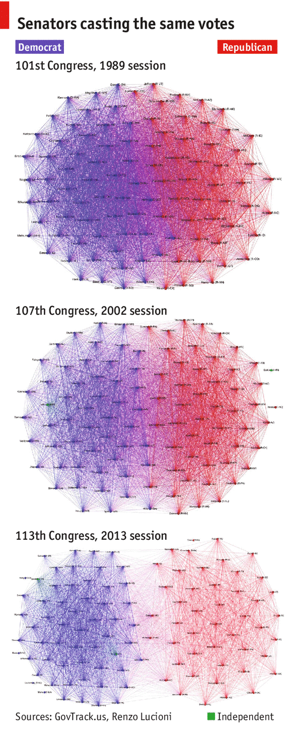
In the visualization, each Senator is represented as a vertex colored depending on their party affiliation, and edge (u, v) is assigned weight equal to the number of times Senator u and Senator v voted the same way (either Yay or Nay). How heavy a edge is reflects how close Senators are in the graph. This gives a great illustration of not only party voting trends, but also which Senators within a party vote similarly.

The article’s content and three graphs support and show that the Senate has grown increasingly partisan over the years. Given the article’s general description of the graph and algorithms employed, its intended audience appears to be the general US population.

We initially thought that the the graphs were very effective at illustrating the increased polarization of the US Senate, but when we did our own exploration of the data (found at govtrack.us) and looked into the means of which the graph was generated, we found that certain measures were taken to overstate the increased polarization.

The original author of the graphs decided to omit all Senators who voted similarly fewer than 100 times. If these edges were included, 2013 didn’t look as drastically different from 1989. By looking at other metrics that look at divisiveness, such as modularity, we found that the truth was quite different from what the article told.

In the chart below, modularity is plotted per year. A higher modularity score corresponds to a more divided Senate. The red dots indicate the years chosen to illustrate the trend.

The year 2002 was selected to best support the narrative that “the Senate is more partisan than ever before.” The reasons news companies do this range from “we didn’t do our due diligence” to a more dubious “this article, while not completely factual, will generate more clicks and traffic to our site.”

In conclusion, I believe that the article was effective at selling their story of a more divided Senate, but failed to show the overall picture of congressional voting trends.

Ventusky – Wind, Rain, and Temperature Maps

Ventusky is a weather visualization platform developed by ImMeteo, a Czech meteorological company who focuses on weather prediction and meteorological data visualization.

Figure 1 Ventusky interface

Ventusky presents worldwide weather maps including wind, rain, temperature, air pressure, etc (Figure 1). It has weather data of the past week and can play the timeline as a progress bar to show the weather change. Ventusky supports users looking up for cities/provinces and provides them with detailed information (current weather, weather forecast, sun and moon info, etc) about the cities/provinces (Figure 2).

Figure 2 Detailed weather information about Boston in Ventusky

Audience of Ventusky can be anyone who is interested in knowing the weather information (current or past) in some places. They can be passengers of flights or backpackers checking the weather in destinations, residents who wish to know the affected area of snowstorm, or even researchers who want to see the current weather or recent weather change.

In my view, Ventusky aims to provide users with up-to-date worldwide weather information through an intuitive map interface. It serves as a platform for users to look at current weather, weather change, and weather forecast in a visualization method but not the conventional way – reading text. By providing multiple features (temperature, air pressure, clouds, etc) that can be integrated in the visualization, it also fits users’ need to look at various weather features in one interface.

In fact, the first wind map I saw is not Ventusky, but this one below (Figure 3). The wind map in Figure 3 is concise, beautiful, and does a good job in presenting flow animation, but not as effective as the Ventusky one. Ventusky not only displays wind map but also other weather features such as temperature and clouds, the combination of which makes the visualization more informative. Moreover, the detailed information such as weather forecast for specific cities/provinces not only makes it helpful to a wider range of audience but also makes sure Ventusky has the value to be revisited by users. Last but not least, the history weather data and play-timeline function also add value to Ventusky.

Figure 3 Another Wind Map

In terms of meteorological data, maps are good presentations since they provide an intuitive view by allowing users to see weathers of different places at one time. Compared to printed map, online maps also do a better job in providing interactive interfaces and allowing zoom-in/out for detail checking. In that way, Ventusky seems to be an effective platform for weather visualization.

However, I feel the color map is a little difficult to read in some circumstances. For instance, when selecting temperature as a feature, the colors for -10°F and 80°F look similar in the map, making some area in Canada and Mexico in almost same color. Another thing may be interesting to consider is whether it’s possible for users to select any two features they are interested in to present in the interface. Currently one feature is fixed to wind and users can change the other feature.

No Ceilings Data Viz Review

No Ceilings: The Full Participation Project was a project done by Fathom studio for the Gates and Clinton Foundations as part of the 20th year anniversary of the UN’s movement to promote international gender equality. The project focuses on several visualizations of different datasets regarding gender inequality. These are of various sizes and complexities.

The homepage features a large visualization that draws the user in to interact with. It shows the gap of men and women in the workforce in different countries.   I like how familiar and chart like it looks, but its design is still very striking and the interactivity is seamless.

There are also mobile visualizations, which are also quite striking. For example, this one looks at child bride rates in different countries. While it is simple, it’s very effective and engaging.

This same visualization can be shown on a desktop.

There is also a map where you can see several different visualizations. This is both on mobile and desktop and serves as a control panel for many of the datasets that have their own visualizations.

Overall, this website is meant for a wide range of people, but specifically geared towards younger people (thus the stress on mobile visualization) and policy makers. I found it very effective because not only are the visualizations appealing they are also quite layered and have a natural flow for the user to follow the story and delve deeper into the data. And the power of focusing on multiple platforms is definitely very effective in terms of practicality.

Shipmap.org: Letting You Interact with Sea Freight

This past IAP, I worked in the new data science group at Maersk Line, the biggest shipping company in the world. One of my coworkers found Shipmap.org, which lets you interact with GPS timeseries data for cargo ships in 2012.

Shipmap.org

I enjoyed this data representation because it conveys many complexities of global trade without overwhelming its audience: the general internet-using population. On my first glance, the site displayed an aesthetically pleasing bathymetric map that showed global ship movements. However, more aspects quickly began to show through. I zoomed in on choke points, such as the Egyptian Suez Canal, the Panama Canal, and even the area around Singapore. The busiest world ports glowed, which actually helped inform my forecasting work the next week. Even unrelated facts such as the Earth’s curvature show in the ship movement–look at the route from the Vancouver to East Asia. The toggles also allow you to view different cargo types, CO2 emmissions, etc., so I feel like I always learn something new when I visit.

Even though this visualization displays fairly raw data, it does a great job of entertaining and informing: what I perceive to be its two main goals. The map’s interactivity entertains users by letting them discover their own inferences, and the map provides a natural way to deeper explore these inferences. These personal conclusions result in a much higher-impact experience than simply seeing charts showing CO2 emissions, cargo flows, etc. The inferences bring the user into the data, personally connecting them to the data’s story.