Endangered Fruits

Presentation here

Team Members: Paul Choi, Miguel Garido, Yi Zeng, Margaret Tian

The data say that the bee population is rapidly declining and that bees are essential to the production of many of our favorite fruits and vegetables. We want to tell this story because we didn’t feel that reading research studies or news articles about the impact of fewer bees on agriculture would feel like a real, actionable problem to everyday people. Our overall goal was to educate people on how they as consumers will be directly affected, and make the problem more personal by relating the loss of bees to the loss of the shopper’s favorite fruit. This sketch only contains the case where a shopper selects watermelon, but we envision that the same process could be applied to many different fruits.

We used the bee data from the Bee Informed Partnership to tell our audience about how declining bee populations puts a lot of things at risk, including our favorite fruits. The target audience is grocery shoppers waiting in line to check out. Our sketch would appear in the form of an interactive touch screen display/quiz that shoppers could quickly navigate through.

The bee data show a drastic decline in bee populations in the past few years. Watermelon production data from the USDA shows that the Southeastern United States produces the majority of US watermelons. Dr. Claire Kremen, assistant professor of ecology and evolutionary biology at Princeton University, found that bees are responsible for up to 80% of pollination for a variety of fruits, so we knew that the large drops in bee population could result in significant drops in fruit production. Since fruits are an everyday product that our audience enjoys, we decided to use the title screen “your favorite fruit is in danger” to draw our audience in.
Maps played a central role in our interactive display. Our biggest issue was smoothly jumping from bee decline to watermelon decline while keeping our audience engaged the whole time. We decided to show bee decline for the entire US, before focusing on the Southeast to transition to watermelon decline, and zoomed back out to show why that fewer watermelons in the Southeast is a problem for all of us. The simple, concise facts combined with cute graphics hopefully make the interactive experience informational and fun.

Buzz About Bees

Sharlene Chiu, Tricia Shi and Zachary Collins

The data says that bees are dying and colonies in many areas are declining in size. We wanted to tell this story because we believe that, although many people know bee populations have been declining, they are unaware of what they can do to help stop it.

Our audience are flower shoppers. Many varieties of flowers offer a means for bees to collect the nectar they use as an energy source. Some can be more impactful than others, allowing bees to gather nectar more easily. People who are already thinking of planting flowers can make decisions that could have an impact on bee populations in their area.

Our goals are to have them understand the problems bees are facing, recognize that planting flowers can help and aid them in picking flowers that both grow well in their area and easily allow bees to collect the nectar they need to survive.

Our sketch is an interactive display that can help localize the problem to the individual. The flow works as follows. We would set up the display in a supermarket / plant nursery / flower shop with an opening display that consists of “Did You Know” bee facts and a clickable map that invites individuals to learn more about bees in their state. Upon clicking they’ll be presented with information about the good bees do for them in their state – plants they help pollinate, honey they produce. Then it will transition to damage being done to bees – Both locally and nationally. This highlights the problem at hand and localizes it to where the individual is from. We present facts like how many colonies have declined over the past year and that bumblebees have recently been placed on the endangered species list. We will then pose that planting particular flowers can help bee populations. Then, we would allow the user to select between different flowers, pulling up a map of what counties in the state these flowers grow well in. Finally, it provides a link where one can learn more information about the problems bees are facing.

Our sketch takes a national problem and localizes to the area the individual is from. It demonstrates a simple way they can help through a platform that is very inviting and easy to use. We attempt to help them understand the existence of the bee decline and point them in the direction toward flowers that can help bees successfully collect the nectar they need. Since they are probably already thinking of purchasing flowers, showing them which kinds help could sway their decisions.

The map display we utilize is important in allowing us to get our message across. We want to provide the buyer information about what grows well in and around their local area. We present the flowers in a checkout guide manner – allowing them to select between them and see pictures of what the fully grown version looks like. Without the bees in mind, this could already be effective in helping them pick out what flowers they like. Giving them options among the kinds that help bees the most pushes them toward making a decision that could influence populations in their area. Placing it on a map familiar to them allows them to compare the locations in which they grow effectively and couldn’t easily be replicated using another form.

Presentation:

https://docs.google.com/presentation/d/1TU-BQillGLeXW1AjuzK7bSShGM1sSE-e9qm2m8Sn-7s/edit#slide=id.p

Sources:

http://usda.mannlib.cornell.edu/MannUsda/viewDocumentInfo.do?documentID=1191

http://uipress.lib.uiowa.edu/ppi/common.php


Take Action Against Gas Leaks in Your Town!

by Mikayla Murphy, Divya Goel, Tina Quach, Brandon Levy

The data say that natural gas leaks are a problem throughout Massachusetts, and it can take Eversource (formerly called NStar), the utility company for 51 of the state’s towns, as long as several months to fix them from the day they’re reported.  We want to tell this story because gas leaks are a big problem with major environmental, economic, and public health consequences, and we want to motivate Massachusetts residents to take action to improve their lives and local community and develop a habit of practicing civil engagement.

Our audience is environmentally conscious adults living in Massachusetts towns where the natural gas is supplied by Eversource. Our goal is to inform these residents about gas leaks in and around their hometowns so that they can judge whether the leaks are being addressed effectively and, if not, demand that Eversource address gas leaks with greater urgency. By addressing leaks as soon as possible, we can reduce their many negative impacts.

We drew our data from NStar gas leak data, which lists gas leaks, the date of report, the date of repair, the gas leak location, and the grade, a rating of the potential danger*. We’ve presented this data through an interactive website module (see mockup here) meant to be shared through climate change and gas leak response advocacy groups in the Massachusetts Area (such as Mothers Out Front). The module

    • prompts the audience for the town they live in
    • presents information regarding why they should care about gas leaks
    • raises questions about how well gas leaks in their hometown are managed by Eversource (How many gas leaks were reported in my town compared to other towns? How long did it take before the gas leaks were repaired? How does my town compare to the towns near me and to the state as a whole?)
    • answers these questions through informative data visualizations
    • asks audience to voice their concerns to local government and energy providers through social media and direct email and/or phone communication


We made 3 visualizations. The first visualizes the total number of gas leaks that each town reported in a choropleth map centered on the user’s specific town and allows him or her to compare the number of gas leaks to that of the surrounding towns (normalized by population). The second is a choropleth map to visualize the average time from report to repair for each town, where darker colors correspond to longer times to repair. We use the color red to convey the urgency and alarm that should be associated with the need to respond to gas leaks. Once again, the audience can easily compare its town to other towns and realize that there is a need to push for faster responses to gas leaks. We emphasize this through our third visualization: a number line plotting where the town lies in relation to other towns and the state as a whole in a more explicitly quantitative way. Our module is effective overall because it conveys information in a visual manner that is easily understood and makes comparison easy. It also uses the target audience’s environmentally conscious attitudes and town pride to motivate them to take action.


Grade 1 is in a contained space and so considered potentially explosive.  Grade 2 is near a foundation and so must be watched.  Grade 3 is everything else no matter how big the amount of gas leaking from the pipe, so low-priority Grade 3 leaks could potentially emit large amounts of gas before they’re fixed.

Home Sweet Home

Home Sweet Home

Ashley Wang, Kimberly Yu, Margaret Yu

The data say that honey consumption in the U.S. is increasing, but the yield per bee colony is declining in the U.S. We want to tell this story because bees are very important for the pollination of approximately one third of the United States’ crop species, including a variety of fruits and nuts. Given the inversely proportional relationship between honey consumption and yield per bee colony and the phenomenon of colony collapse disorder, beekeepers should be well-informed of the situation of bee colonies in their state. Our audience is potential hobbyist beekeepers. Our goals are to provide beekeepers with information about trends in yield per colony in their state as well as resources for becoming a beekeeper.

We looked at USDA datasets from the years 2000 – 2016 as well as the winter loss rate from the years 2007 – 2016 and yearly honey consumption data from the USDA. From the winter loss rate data, we see that the number of bee colonies is decreasing at higher rates.

We used Tableau to create a time series of the yield per bee colony in the United States between the years 2000 – 2016. The hex tiles represent the honeycomb constructed by bees, and each hex tile corresponds to a U.S. state. The golden-yellow hues represent the amount of honey and the yield per bee colony. The darker the hue, the higher the yield.

Presenting the data as a time series using hex-tile maps provides the audience, potential hobbyist beekeepers, with relevant information on how productive/healthy bee colonies are in different states.

Clicking on a state will reveal more detailed statistics on metrics such as production, stocks, and average price per pound as well as resources such as links to websites for beekeepers in a specific state and general beekeeping resources. We included this user interaction because we feel that potential hobbyist beekeepers could benefit greatly from learning about the details of beekeeping within a specific state.

National Honey Bee Day (the third Saturday of August) would be a promotional day where Amazon would display the slides on their website and have a sale on bee starter kits, and grocery stores can set up a special booth selling honey and bee starter kits as well as displaying screens with the slides.

Bee Kit

The Bee Kit

Meghan Kokoski, Nina Lutz, Nikki Waghani

The data says that the bee population is on the decline and this has a larger effect than just the cost of honey. We wanted to tell this story because many people are aware that the bee population is declining, but they lack the “so what”, and can be unsure of how to help the situation. According to FOX news, “The honey bee contributes to a third of the country’s food supply”. This comes mainly in the forms of fresh fruits and vegetables.

For our data visualization, we used the historical bee data to create a simple, yet powerful map. The map displays outlines of the states which currently (2017) have 60% or more of their pre-crisis populations. Based on research we determined the bees were at healthy rate in 1990, thus we used the historical data from 1990 to calculate the population differences.  

We envision our map being the attention grabbing sign for an activist group at a farmer’s market. The data visualization will have a titled overlaid asking “Is your state on this map?” This will intrigue shoppers at the farmer’s market to come to the booth. At the booth bee care packages will be handed out. Included in these packages are items that can help individuals do their part to improve the bee population. There will be seeds, bee-friendly local honey, a water basin, and information on how to take further measures.  


We believe the farmer’s market will be an effective place for our visualizations because the audience, farmer’s market shoppers, are primed to care about the bee crisis. Without bees to pollinate produce, the fresh fruits and vegetables found at a farmer’s market would cease to exist.

Shopper that were aware of the bee crisis would welcome the bee kit and further information on how to help. Though, if shoppers were unaware of the importance of bees, they will be drawn in by the visualization and learn about the connection. They will have an interest, because as farmer’s market shoppers, they already enjoy the benefits of bees.

Lawrence Sun’s Data Log

This is a summary of types of data I created and were captured in digital form on 5/1.

At 9 AM I wake up to my phone’s alarm. I briefly check my e-mail before heading downstairs to grab some breakfast. Already I am creating data: by using Google chrome on my phone several entities are tracking my behavior. Google is logging my behavior due to using Chrome, MIT because I am connected to their routers and checking their e-mail servers. We could go further and say MIT’s ISP, DNS servers, etc. are also logging data but at that point they don’t know the data is me, Lawrence Sun, browsing the internet.

At breakfast I swipe my ID at the registrar. This is logged by MIT’s techcash and dining services. While eating, I catch up on various things on my phone. Reddit, Gmail, Quora, and the New York Times are all logging data about my visit.

I leave my dorm for class. Because I am now moving with my phone, Google is tracking my location with my phone’s GPS.

After class, I get a burrito at Anna’s and I pay for it with my credit card. Both Anna’s accounting services and my bank (Bank of America) log this transaction.

I then go to my afternoon class. I open my laptop and start browsing the course website; it is hosted by CSAIL and the course notes are being hosted by NB. Both CSAIL and NB are logging my behavior.

After my classes are over, I return back to my dorm and stay off the grid for a few hours. Dinner time comes around and again I swipe my ID and my meal is logged. After dinner, I work on some work for my classes. I need to read a paper for one of my courses so I visit arXiv to retrieve the paper. After I finish reading the paper, I submit answers to some questions to an MIT PDOS website. Both arXiv and PDOS are logging my activity. After this I visit MIT Stellar to browse the upcoming homework for another one of my classes. Finally, I am left writing this blog post, leaving another data footprint at WordPress in this case.

A Map of the Internet

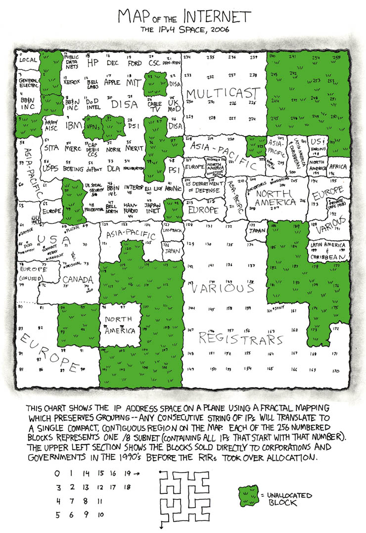
I was reading about the recent selling of IPv4 addresses by MIT to Amazon and in some of the discussion a rather old but classic data visualization popped up:

This is, of course, the xkcd “map of the internet”. The data that is being shown is which entities own certain IP address ranges: essentially blocks of the internet. For example, in the data visualization we see that MIT owns IP prefixes that start with 18.

The audience of this is the same as the usual audience to xkcd, which is very broadly speaking nerds on the internet. The goal of the presentation I think is to show that relatively few players control the whole internet; you’d think that with there being over 4 billion possible IP addresses there would be a lot of freedom but in reality there are only around 100-200 players who own everything and license out IPs to others.

I think the visualization is effective given the target audience. To a general person, this is probably too cluttered because so much data is being shown. However, as xkcd viewers are generally “nerdier”, they will be willing to spend more time to investigate and thus that issue wouldn’t immediately discredit the visualization. The fractal mapping explained at the bottom is an efficient way to compress the previously 256 data points to a 16 x 16 square while still keeping contiguous regions together (so for example, the blocks Europe owns are all grouped together) which greatly enhance readability given the constraints they’re working with. Probably the only glaring flaw I’d say is this is outdated; this was made 11 years ago and the IP address layout has changed quite a bit, so it shouldn’t really be used as a discussion point today anymore. However, in its time I think it did a great job given the target audience and the data it wanted to present.

Polar Bear and Glaciers: Seal Your Survival

by Margaret Tian, Tony Zeng, Tina Quach, Willie Zhu

The data says that sea ice cover in the Arctic is declining year-over-year. Declining sea ice is a major factor in the decline in polar bear populations because they primarily hunt on the ice. Thus, melting ice caps reduce polar bears’ ability to feed themselves and raise their children. From 2001 to 2010, polar bear populations have dropped by 40%. We want to tell this story because as a young child, you may hear about global warming, but not really know what it means or why it’s so bad. Even if you already associate melting ice caps with sad polar bears, do you really know what that looks like?

Our audience is 8 – 11 year olds who like animals and have yet to learn about the impact global warming has on their animals. Our goal is to use the specific example of melting ice caps and polar bears to teach these kids about how global warming hurts the animals they love. We accomplish this, through our design of a physical, Candy Land-inspired board game, Polar Bear and Glaciers: Seal Your Survival.

Depiction of our gameboard with the some ice tiles on it.

We used Arctic sea ice data to determine the amount of ice cover for each time period corresponding to each stage of the game. In particular, we looked at the amount of ice cover in the Bering Strait in 2012, 2014, and 2016. As the amount of ice decreases in the real world, the amount of ice in the game decreases proportionally. This is intended to mirror the struggle that polar bears have in the real world due to sea ice loss by increasing the difficulty of the game.

Our physical board game is an effective way to tell this story because it is a physically engaging, social way to collectively empathize and learn about the polar bears and their struggle for survival. Each player is put into the shoes of a polar bear that needs to eat at least 8 seals in order to survive the year, reflecting the real amount a polar bear needs to survive. As the players progress through the game, they discover how it gets harder to get the seals as the proportion of water to ice increases (See Game Rules here).

Race for Fuel Efficiency

Team members: Paul Choi, Miguel Garrido, Lawrence Sun, Kimberly Yu

The data say that different car models have different fuel economy levels, and the driving speed also affects how fuel efficient the car is. We want to tell this story because fuel efficiency is determined by so much more than just the type of car you drive. Most people are aware that certain cars (e.g. Prius) are more fuel-efficient than other cars (e.g. Ford). However, not everyone is aware that when you drive a car at a speed faster than its optimal speed, the car’s gas mileage decreases, more greenhouse gases are produced, and you end up wasting gas and money. Our audience is car buyers and drivers, and our goals are to teach participants about fuel efficiency for different cars at various speeds, and help them make better driving choices.

Our participatory data game is a digital multiplayer game where the goal is to reach the destination in the least amount of time while spending the least amount of money. Players are given 5 gallons of gas per round, and each gallon costs $3. Each round, a player chooses 1) a car model from four options (or keeping their current car) and 2) speed (ranging from 30 mph to 90 mph). After each round, the player’s balance is updated, and the player’s car animates across the screen to reflect the distance traveled and its speed. For each subsequent round, the player can choose to keep the car or choose a different car. A timer keeps track of how long it takes the player to travel 1000 miles, and the amount of money the player has spent is displayed. At the end of the game, a weighted total score is displayed. Choosing the type of car and the speed while attempting to reach a destination within a time limit helps the player discover and learn that the type of car and the speed both affect fuel efficiency, and there is a tradeoff between time and money spent.

We based our data game off of the US Fuel Economy measurements and the MPG for Speed Calculator. Given the MPG values for vehicle models from the 2017 Fuel Economy guide, the MPG for Speed calculator helped us calculate the cost, distance driven, and driving time for each round in the game. The higher the MPG, the more fuel-efficient a car is, and the less greenhouse gas emissions the car will produce. However, if a car is driven faster than its optimal speed, the car becomes less efficient because the air resistance increases. We envision this game being incorporated into websites for car manufacturers, especially those that produce cars with high fuel efficiency, or at car dealerships. Car manufacturers can use this game to playfully inform customers about how fuel-efficient their car is compared to other cars. Car dealers can use this game to help customers make better decisions as well as make waiting time more exciting and beneficial.

Driver Personality Quiz

Team: Almaha Almalki, Mikayla Murphy, Ashley Wang, and Jingxian Zhang

The dataset we focused on was the US Fuel Economy Measurements. We noticed that fuel economy is not only related to vehicle classes but also to drivers’ driving habits, and found a list of tips and trips to improve fuel efficiency. We hope to tell a story about how driving habits and advanced vehicle technologies can improve fuel efficiency. Our target audience are car owners who want to save money in fuel efficiency. Our goal is to present players some knowledge about fuel efficiency (especially for vehicles they own) and how good their driving habits are.

Figure 1

The game will be on a racing arcade machine where players can have physical driving simulation. The screen is also a touch screen for all the digital interaction (Figure 1). In the game, players will be asked to finish a task, e.g. going to grocery store, in a route they select (city, highway, interstate). To win the game, they should try to reach higher fuel efficiency. Players start the game by choosing a vehicle and choosing a route (Figure 2). Then, they will answer some questions for the vehicle set up, such as whether to enable start-stop system and whether to take the canoe off the vehicle.

Figure 2

When en route, the game will monitor players’ driving habits such as whether they exceed speed limit and whether there are hard acceleration and braking. At the end of the game, players will receive their race result and their personal driving profile, which they can print out or share on social media (Figure 3). In the handout, players are shown how their driving habits and vehicle setup affects the money they can save on fuel and how to improve their fuel efficiency. By playing the game, players can actually relate their driving habits to the accurate amount of money they can save, and the driving personality in the profile can be a fun way for them to know how they drive and what to improve.

Figure 3