The Rhythm of Food

Google searches on the universal topic of food can tell a very interesting story about food trends. I recently came across The Rhythm of Food, a collaborative effort between Google News Lab and Truth & Beauty to explore patterns in food trends based on Google searches over the years starting from 2004. 

The one-page website provides a scrollable, rather adventurous experience of viewing food trends, starting with the rise and fall of certain diets, cuisines, and recipes between 2004 and 2016. Scrolling further yields a circular timeline for the apricot fruit with annotations that explain how to interpret the timeline. The popularity of Google searches for the food item is measured by a Google Trends score collected weekly.

Apricot circular timeline with annotations

A visitor to the website can view food trends by month to see what’s trending at a specific time of year. A visitor can also discover specific food trends with a more advanced search.

advanced search for food trends

It is hard to simply stumble upon this website, and given the large collection of food items with timelines, I think this data presentation is for people curious about the seasonality of a specific food item or looking to discover food trends in general.

The website does a good job of presenting the data as a story. Each food item has its own story in the form of a circular timeline and the website presents the data visualizations in a story-like way that encourages the viewer to keep scrolling to answer questions like “What are the most common patterns?” Some timelines even have special annotations for events that triggered sudden popularity. Personally, I wish there was also a way to compare seasonal popularity between different food items in a single interactive visualization.

Tina’s Data Log – 2/11/2017

Maintaining your own data log, being mindful of the data you create, can open your eyes to the many ways you may unintentionally/unconsciously create data. And that raises the question: What counts as data? For the sake of this blog post, my working definition is that data is any saved, intelligible information or state or log that (almost) directly results from my actions.

  • Homework
    • Search history from looking up things I didn’t know about in my reading about positioning methods
    • created an basic weather checking app that sends requests to a weather API
    • blogged this post
    • highlighted and wrote notes (digital highlights and stickies) on a pdf of a reading I had for CMS.701 Current Debates in Media
    • a text file for notes on CMS.631 (this class!) readings.
  • Trip to Trader Joes
    • purchase data (credit card bill)
    • Uber request/trip/payment info
      • location data sent to Uber’s servers
  • Video for a Friend
    • took several photos
    • took several videos
    • edited these together to make another video
    • purchased a drink from a friend using Venmo
  • Social Media/Communication
    • emails and actions taken to interact w/ email (e.g. delete or star emails)
    • text messages on Messenger and over the phone
    • Facebook
      • liked a few pictures
    • every single request (HTTP, etc.) going out of my Chrome browser
    • stored cookies (visiting certain websites)
    • my Chrome web history

Reviewing my data log, I see that the majority of the bullet points I listed was media I explicitly created for human viewing. On the other hand though, the majority of data (in terms of size) was probably data that I wasn’t intentionally creating–my search/web history, HTTP requests and more.

Tricia’s Data Log 2/11/2017

  • Internet Browsing (data logged = unique/concurrent user): news, Reddit, this blog, readings for other classes
  • Email (data logged = text, files): TA staff emails, contacting professors, etc., one email had an attached html/jpg file
  • Chat/Text (data logged = text): I texted my family and talked to friends on Messenger
  • MITx progress (data logged = video views, question scores)
  • Video Browsing (prerecorded) (data logged = 1 view, other data to Google about my viewing preferences): I watched YouTube for fun and to see the Asian Dance Team (ADT) setlist.
  • Dance (data logged = video of me dancing, preferences about dances): I went to ADT auditions, and they filmed us dancing the choreography at the end. I also had to fill out a form that logged what dances I liked and my availability.
  • Music Preferences (data logged = thumbs up for songs on Pandora, stations listened to for Pandora)
  • Game Data (data logged = progress in game, network stability is also logged for League): I played Fire Emblem, Pokemon Go, and League of Legends.

Data Log: 2/11/17, Nina Lutz

Discrete Events:
  • Ordered stuff on Amazon
  • Ordered stuff on Instacart
  • Watched some YouTube videos
  • Make a Dominos order for a dorm event
  • Paid my credit card, and with my card for the things above
  • Splitwised my friend Joyce when she paid for the Uber to go to lunch with friends
  • Splitwised other friends when I paid for lunch
  • Used Lyft to get us back from lunch
  • MIT printer authentication when I printed some forms
  • Watched some Netflix
  • Blogged this post
All day: 
  • Steps counted on my phone
  • Background syncing on apps (DropBox, Evernote, Creative Cloud, iCloud) while I was doing my work on my computer
  • Social media (Twitter, Facebook, Snapchat, Tumblr, Snapchat)
  • Emails throughout the day
  • Text messages throughout day
  • Various MIT ID taps as I traveled through the dorms
  • Certificates and password keychain access when I was visiting certain sites
  • Various logs from my terminal when I was utilizing it to do different commands and write small pset scripts throughout the day
  • Internet history, caching, cookies, etc

Brandon Levy’s Data Log for February 9, 2017

On Thursday, February 9, I produced the following digital data:

  • Played Pokemon Go – hit the pokestop at my apartment building a bunch of times and caught a few pokemon
  • Fitbit – got 10,549 steps (met my step goal for the day despite the weather!)
  • Surfed the Internet – among many other things, I checked my email and Facebook, watched an episode of “Santa Clarita Diet” on Netflix, watched Wednesday night’s episodes of “The Daily Show” and “Full Frontal With Samantha Bee,” and used the WatchESPN app to watch the Duke vs UNC basketball game
  • Text messages – texted with a classmate about a group project and a friend about the Duke vs UNC basketball game
  • Swiped my MIT ID at a Pharos printer to print the readings for next week’s classes
  • Used my credit card to buy an external hard drive on Best Buy’s website


The Story of California’s Drought

I’m from Southern California, and one of the biggest issues in the state recently has been the drought. This series of 259 drought maps shows the drought level in the state of California from December 2011 to February 2017.

At the top of the visualization is a legend assigning a color to different drought levels:

Legend

The drought maps are then displayed chronologically in a grid, left to right and top to bottom.

The sheer amount of red on the maps in early 2014 helps viewers easily understand how dire the situation was and why Governor Jerry Brown declared a State of Emergency in January 2014:

Early 2014

Scrolling to the year 2015, California is mostly dark red, indicating a level of “Exceptional Drought”. The shrinking of dark red areas in the spring 2016 maps show that the drought is improving. And then in early 2017, only a small part of California is dark red and in extreme drought:

Early 2017

This visualization clearly tells the story of California’s drought. The yellow-orange-red color scheme connotes fire and heat, which is strongly correlated to drought, and the color gradient for different drought levels reflects light/dark color connotations in society. The viewer can easily identify the year corresponding to the maps, and a date pops up when the viewer hovers over a particular map. Being able to instantaneously see maps from different times really helped me understand when the drought got worse, how bad it was, how long California was in “Extreme Drought” for, and how impactful the storms last month were.

Although the viewer may get lost in the rows of red/orange/yellow sock-like shapes, I think the designer’s choice to lay out the maps really serves its purpose of guiding the viewer through the story of California’s drought. If the designer had used a single map and a scrollbar that, when dragged, alters the map to reflect the drought over time, some parts of the story might have been lost in the time-lapse because the viewer would only be able to make immediate comparisons. This data presentation relies on color connotations and a series of snapshots to enable Californians, people interested in climate change, and others curious about the drought to better understand how drought levels changed in California in the past 4 years.

Data Log for February 10th, 2017

  • Woke up and left my room. Recorded by cameras and wireless signal logs.
  • Checked email, news, other misc. websites which were tracking me.
  • Ate lunch/dinner at Maseeh by swiping my MIT ID.
  • Wrote some code for my UROP project, uploaded a new dataset to Dropbox.
  • Returned a book at the COOP, refunded to my credit card.
  • Watched videos and did exercises on MITx.
  • Picked up a package at the front desk, recorded by their system.
  • Used my MIT ID to print at Athena cluster.
  • Scanned a few pages from my notebook into Google Drive.

Sean Soni’s Data Log

  • 10:30 AM – Added course staff emails and phone numbers to 6.042 staff website
  • 11:00 AM – Uploaded staff personal websites to 6.042 student website
  • 1:15 PM – submitted form to 6.03 staff indicating schedule
  • 1:30 PM – added PE course into my Google Calendar
  • 2:00 PM – created neighborhoods on SimCity
  • 3:30 PM – entered credit card information into Eat24 for food delivery
  • 5:45 PM – wrote this blog post
  • 6:15 PM – emailed professor to ask about adding category for assignment
  • 6:45 PM – placed trade on Robinhood
  • 8:30 PM – edited more staff info on 6.042 website
  • 9:45 PM – edited htaccess file for 6.042 repo
  • 10:30 PM – submitted this blog post

Crazy Things That Are Illegal (And Legal) To Do In A Car

Have you ever wonder whether driving while wearing headphones is legal? Or if you can drive barefoot?. All these questions and more can be answered through an interactive visualization platform called “Is it illegal to Drive ..?“. The platform uses a nice map to provide the answer to the most-Googled questions about driving laws in the US. It is developed by Just Park to show the inconsistencies in U.S. driving laws.

The platform lets you click on an animated map of the United States with bubbles for each state. As the headline question changes, the bubbles change color to show whether an action is legal (green), inadvisable (yellow), or illegal (red.)

Inadvisable activities can possibly get you in trouble, depending on the discretion of a traffic officer. My advice is if you see anything not green, just avoid doing it. That includes, for example, driving while tired or barefoot.

Also, one of the most surprising facts in this mini-site, that driving your car with a beer in your hand will not get you cited as long as you are under the legal limit in Mississippi. You can find several interesting driving facts on the platform, and if you want to fact-check the numbers, there is a Google Docs spreadsheet with all the sources.

In the US, finding driving laws is not simple, since it depends on in which state you are in. The goal of this interactive platform is to speed up the process of finding answers by visualizing what is against the law and what isn’t in each state. In that way, people can find their answers and gain more knowledge about the driving laws in general in the US. This platform is intended for a broad range of people, so the use of interactive visualization is an efficient way to enforce laws. Also, it encourages people to know their rights without having them to read endless documents.

In the end, stay away from New Jersey, unless you want to speed past a funeral procession while wearing headphones, and with a missing front bumper car.

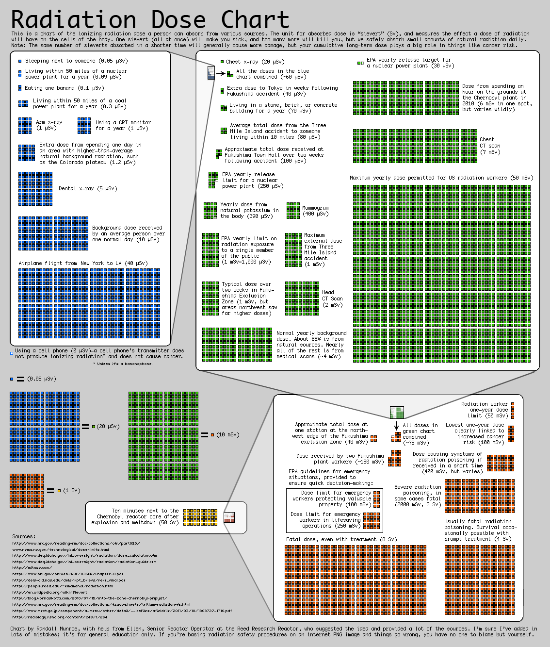
Radiation Chart

A while ago I came across this chart by Randall Moore, the creator of the webcomic XKCD. The chart aims at representing the average ionazing radiation dose due to different sources. As explained in the top of the chart, the radiation dose is measured in sieverts (Sv). The sources reported range from regular activities, such as airplane flights or medical procedures, to doses due to carastrophic events such as Fukushima and Chernovyl.

The main objective of the visulization, however, is not just reporting the absolute values of this sources but representing their relative strengthThe graph tries to make really apparent the different orders of magnitude of the different doses, which is a concept often difficult to graps when just a number is reported.

I think the visualization uses some effective techniques, such as embedding the previous order of magnitude chart into the next to clearly represent their relative importance. However, I think the chart as a whole is not as clear as it could be. There is a significant amount of text, and the goal of the visualization is not inmediatly clear upon first inspection. I also think the layout could be improved by placing each order of magnitude either above or below the other one, to create a linear path for the viwer to follow.

The chart is directed to a general audience, although to understand it’s relevance you have to already know what radiation is.